


Making insurance clearer through a more intuitive digital experience.
Liberty Insurance serves customers in Malaysia across personal and business insurance. Its website needs to support different moments: exploring cover, understanding a product, finding claims information or getting help when it matters.
admiral.digital brought together UX strategy, content structure and website UI design to create a more coherent experience across those needs. The work translated Liberty’s established brand into a responsive interface, with connected page templates and clear routes through a broad range of products and services.
The priority.
Help customers find relevant information, understand their options and identify the right next step.
An insurance website serves people with very different intentions. Someone researching cover needs guidance and explanation. An existing customer looking for claims support needs direct access to practical information. A person seeking roadside assistance needs a clear route to help.
The design needed to accommodate these journeys within one consistent website, balancing product discovery with the needs of existing customers.
Our approach.
We connected the visual design with the structure and content underneath it.
UX work considered customer needs, navigation and the relationship between product, service and support pages. Information architecture helped organise the content, while UX copy supported clearer labels, explanations and calls to action.
These inputs informed wireframes and detailed desktop and mobile designs, creating a shared framework for the website’s appearance and behaviour.
The work.
A consistent interface across a complex website.
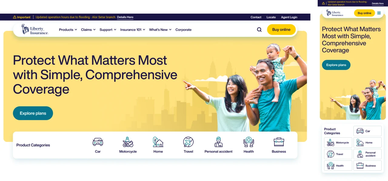
We developed high-fidelity website designs that applied Liberty’s existing brand identity across a broad set of page types.
The work covered the homepage, product listings, product category and detail pages, corporate information, editorial content and customer support. Shared navigation, content patterns and interface elements gave these different sections a consistent visual language.
The emphasis was on clear hierarchy: helping visitors recognise where they were, understand the information in front of them and see where to go next.
Clearer routes to products and support.
We structured journeys for both prospective and existing customers.
Product listing and category designs created routes into personal and business insurance, while detail-page templates organised product information into a more accessible format.
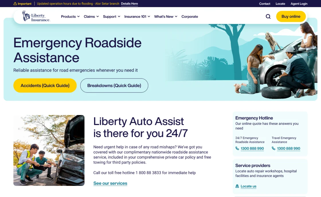
Claims guidance, roadside emergency support, contact information and location search received dedicated page designs. This gave service needs a clear place within the experience alongside product exploration.
Content structured around customer needs.
We worked on information architecture, content requirements and UX copy alongside the interface design.
Headings, navigation labels and calls to action were considered as part of the journey. Page structures established where explanations, supporting documents and next steps should sit, working with Liberty’s product information and branded content.
This connected the presentation of information with the task a customer was trying to complete, whether exploring cover or finding assistance.
Responsive templates with a practical handover.
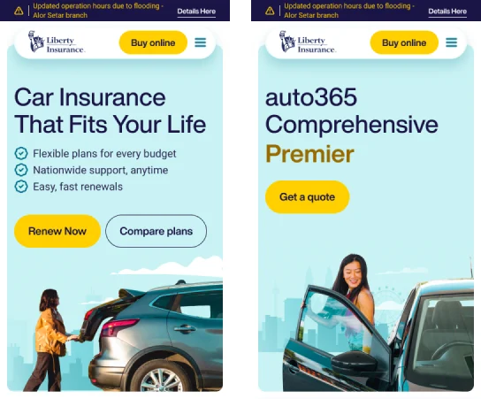
We developed desktop and mobile designs across the key page types, supported by reusable interface patterns.
The handover connected designs with page templates, functional requirements and implementation briefs. It covered shared elements such as navigation and search, as well as the needs of individual product, claims and support pages.
This gave implementation teams a detailed reference for carrying the design intent into the website.
The result.
A cohesive website design system that brought product discovery, customer information and support into one connected experience.
Liberty gained detailed responsive UI designs, structured page templates and supporting guidance for implementation. The work established a clearer visual and content hierarchy across the website, with dedicated journeys for customers exploring insurance and those seeking assistance.
The result was a stronger design foundation for a customer-focused digital presence.
Let’s discuss your priority.
Connect your brand, marketing and digital experience around the result you want to achieve.