

Six practical principles for CTA design
Make calls to action understandable and usable through clear labels, sensible placement, accessible states and reliable destinations.

A call to action should help someone understand what they can do next. Its label, visual treatment, placement and destination all contribute to that decision.
Make the action recognisable
Give the primary action enough contrast and separation from surrounding content to be identifiable. Do not assume that one brand colour or a brighter shade will always convert better.
Check the control in its actual states and background. Keyboard focus needs to be visible, and essential meaning should not depend only on colour. A control that looks effective in a static design can still be hard to find or use in the finished interface.
Give it enough usable space
A mobile control needs a practical touch area and enough separation from neighbouring actions. Test the real rendered control rather than measuring only the visible text or icon.
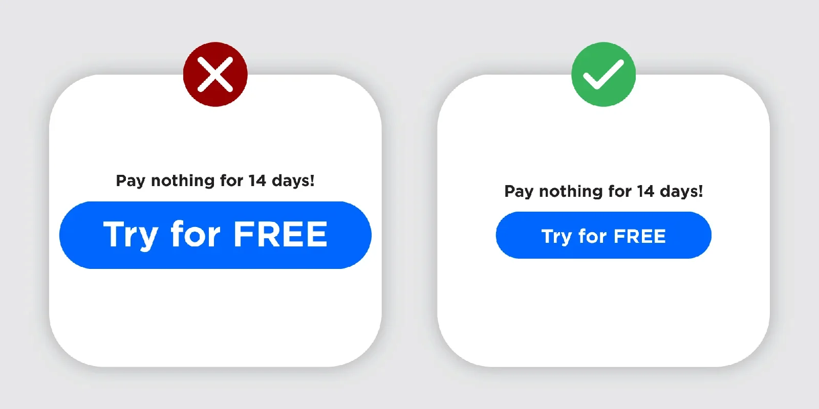
Size should suit the hierarchy. Making every button enormous removes the distinction between the main task and supporting choices, and can crowd a short screen.
Use spacing to show the relationship
Place an action near the explanation it belongs to. Give it room without separating it so far that the relationship becomes unclear.

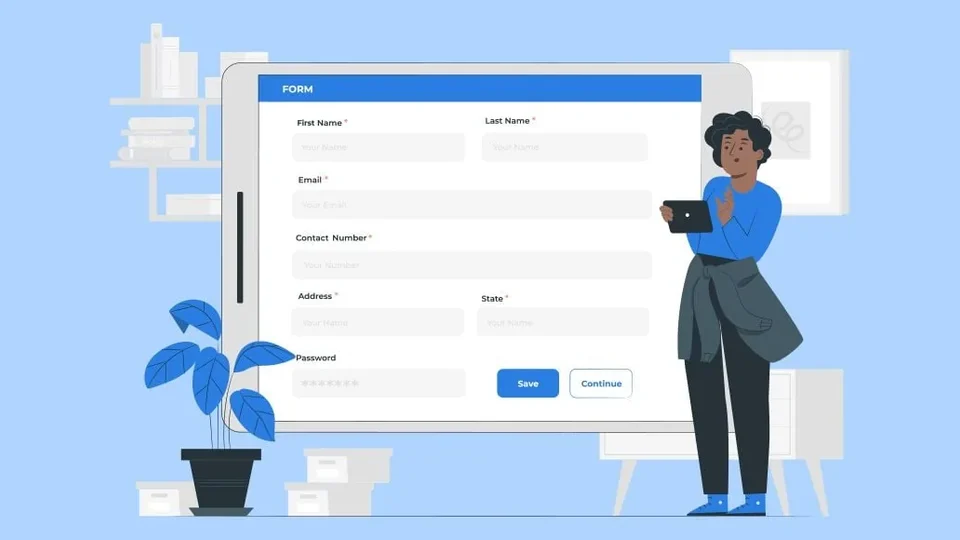
Spacing is part of a reusable system. Review how it changes when columns stack, content grows or an error appears, especially in forms and sticky mobile controls.
Write a label that matches the next step
Use wording such as “Explore services”, “Read the case study” or “Send enquiry” when it accurately describes what follows. A vague “Submit” or repeated “Learn more” can make different actions harder to distinguish.

Avoid promising an immediate booking if the user is actually sending a request for someone to respond later. The conversion-copy guide looks at how labels and supporting content set expectations.
Place the action where the person has context
A visitor may be ready to enquire early, while someone researching a complex service may need proof first. Provide an appropriate route without interrupting the reading experience with competing calls to action.
A modal can keep the enquiry in context, but it still needs reliable loading, accessible focus, a clear close action and a usable fallback. A link to a dedicated page can also be the right choice. The pattern should serve the task rather than feel fashionable.
Measure completion, not just clicks
A button that attracts more clicks may not produce more valid enquiries or purchases. Check the destination, form completion, lead quality and the relevant operational handoff.
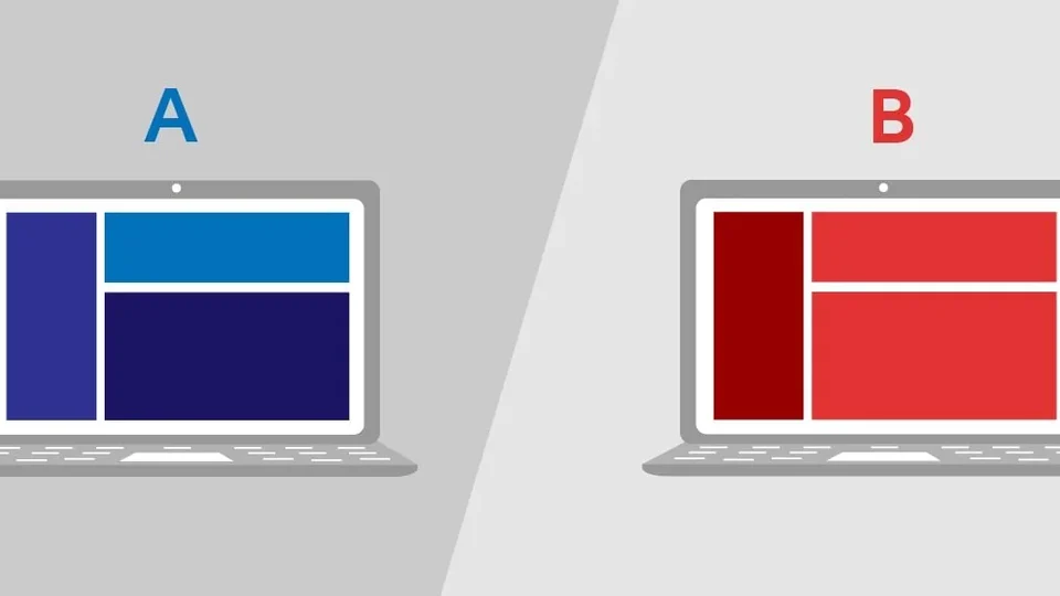
Test a specific hypothesis when the evidence and traffic support it. The experimentation guide explains why a credible comparison needs suitable assignment, duration and analysis. Clear, dependable actions are the foundation; colour experiments cannot repair a broken journey.

What would you like to achieve?
Tell us what you want to change. We’ll help you find the right starting point.