

Lead form design: make enquiry easier
Design enquiry forms with purposeful fields, clear labels, useful validation and a dependable path to accepted submission.
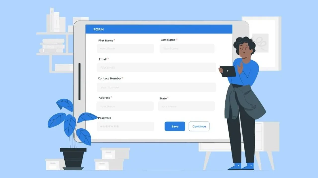
A useful lead form helps someone make contact with confidence. It asks for information the business can justify, explains what is happening and makes recovery straightforward when something goes wrong.
Start with the purpose of each field
Identify what the team needs to respond, route and qualify the enquiry. Keep additional questions only when their value warrants the effort or sensitivity involved.
Shorter is not automatically better. A suitable qualification question can help both parties, while an unexplained optional field can still create confusion. Evaluate form completion alongside the quality and handling of accepted enquiries.
Give the form a predictable reading order
A single-column layout is often a useful starting point, particularly on mobile. Closely related fields can sometimes sit together when the reading and focus order remain clear.
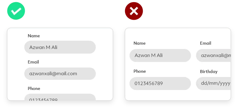
Check the actual keyboard sequence and enlarged text. A visual arrangement that looks tidy at one width can become ambiguous when fields wrap.
Put errors where they can be resolved
Explain the problem beside the relevant field and associate the message with its control. Keep entered values where safe and help the user reach the field that needs attention. An overall summary can support this; it should not be the only explanation.
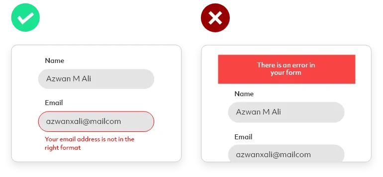
Distinguish validation from service failure. A failed network request is not evidence that the person's email address is invalid. Give a useful retry or alternative contact path without creating duplicate enquiries.
Choose controls for the actual decision
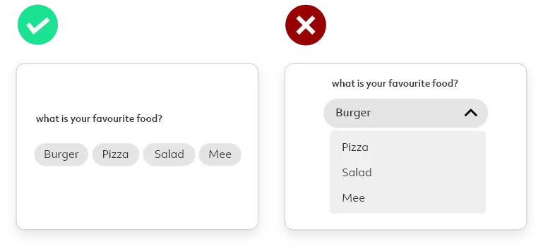
Visible choices can help when there are few clear options. A select control may suit a longer list. Use meaningful grouping and labels rather than applying a fixed number-of-options rule to every situation.
Keep labels close enough to identify their fields and use an alignment that supports a clear reading order.
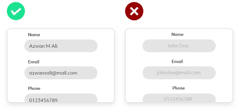
Support input without surprising the user
Use suitable input types and autocomplete purposes where appropriate. Prefilled information should be visible and editable when the task permits it. Do not quietly replace something the person typed with tracking or CRM data.
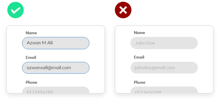
Keep a persistent label rather than relying on placeholder text that disappears during entry. The W3C form-label guidance explains how associated labels identify controls for different users and input methods.
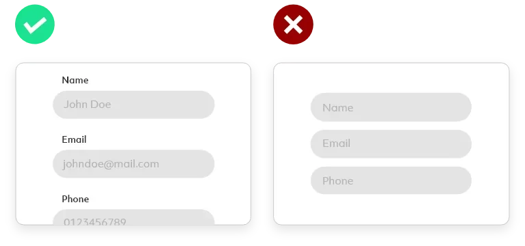
Explain completion and the next step
An enquiry button should describe the action accurately. During submission, communicate progress and prevent accidental repeated requests. After acceptance, clearly confirm receipt and explain the next step the business can actually provide.
For an enquiry modal, check focus, close behaviour, preserved input and keyboard clearance. A visible fallback contact page remains useful if enhancement fails. The CTA guide connects the opening action with the form experience.
Review the complete path from campaign to accepted enquiry and operational follow-up. A visually polished form is only one part of a dependable lead journey.



What would you like to achieve?
Tell us what you want to change. We’ll help you find the right starting point.