

UX and UI design for useful business websites
Connect customer research, information architecture, interface design and testing around real website tasks.
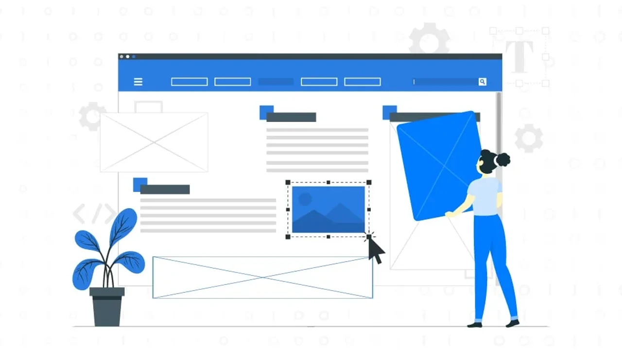
User experience and interface design address connected questions. Can someone complete the task they came to do? Does the interface make the route understandable, usable and recognisable as the brand?
Understand the problem before designing screens
Begin with customer needs and the business objective. Review existing content, service questions, analytics and research. Talk to the people who use the experience and the teams who support it.
Turn broad ambitions such as “make the website modern” into concrete questions. Can a prospective customer compare services? Can a returning user find the next step? Where does someone become uncertain or need assistance?
Know how UX and UI work together
UX work can include research, information architecture, journey design and interaction design. UI work gives those decisions a usable visual expression through typography, layout, colour, components and states. The responsibilities overlap and depend on the team.
A polished screen can still lead to a poor outcome if the information or process is wrong. Equally, a sensible journey can be difficult to use if its controls are unclear. Evaluate the full task rather than declaring one discipline complete before considering the other.
Develop structure before detail
Map the content and the important routes. Sketch or wireframe the sequence, including alternatives, error states and what happens after an action. Use a prototype when it helps answer a specific question.
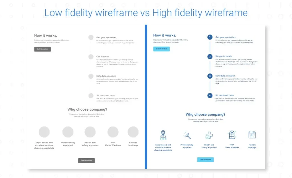
Low-fidelity work can make structural decisions easier to discuss. More detailed design helps test hierarchy, legibility and brand expression. Choose the fidelity needed to resolve the uncertainty rather than treating every project as the same fixed sequence.
Design the states, not just the ideal screen
Include empty results, loading, validation, successful completion and recovery from failure. Make it clear which action is primary and give controls predictable behaviour.
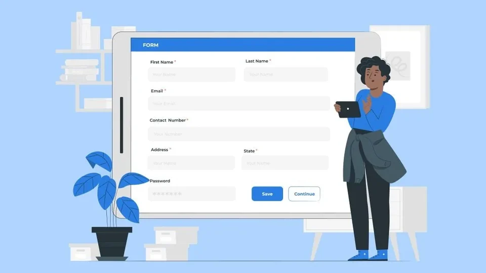
Check mobile layouts with realistic content lengths and a keyboard open. A form that fits a desktop artboard may become difficult to complete on a short screen. Keep essential actions available without relying on hover or on a perfect network connection.
Accessibility belongs in these decisions from the start. Use meaningful labels, a logical heading order, visible keyboard focus and appropriate contrast. Visual design should reinforce the structure that assistive technology also needs to understand.
Build a reusable visual language
Define shared rules for type, space, controls and feedback. Reusable components reduce accidental variation and make future improvements easier to apply consistently.
Consistency does not mean every page should look identical. An article, a case study and an application have different jobs. Share the underlying language while letting the composition serve the task.
The visual-hierarchy guide looks at how these rules direct attention. The lead-form guide applies them to a particular conversion journey.
Evaluate the experience in use
Combine observed behaviour with direct feedback. Find out whether people understand the offer and can complete the intended task. A click count may identify a question; it does not explain why a person hesitated.
Use the findings to prioritise changes, then check the result. Good UX/UI work connects research, content, design and implementation rather than ending at a handoff of attractive screens.


What would you like to achieve?
Tell us what you want to change. We’ll help you find the right starting point.