Lead forms help companies gather information about people who are interested in their products, services or promotions. For B2B, lead forms are a primary source of inbound leads as opposed to B2C e-commerce websites, where customer information can be collected during a transactional process.
The components of a lead form are usually a box with labels and fields that have a call-to-action (CTA) button.
In this article, we’ll reveal lead form design best practices that have the highest chance to result in conversions.
Lead form design meets UX
The design of your lead form has a high impact on your website’s overall user experience (UX). A poorly-designed form may lead to high website bounce rates and a frustrated user — which in turn, directly causes a decrease in conversions and sales for you. Meanwhile, a well-designed form gives website visitors an impression that your brand is professional and thoughtful. This helps build trust — leading customers more likely to convert.
Six lead form design best practices
Here are 6 lead form layout best practices in 2022 that we suggest should be incorporated into any lead form.
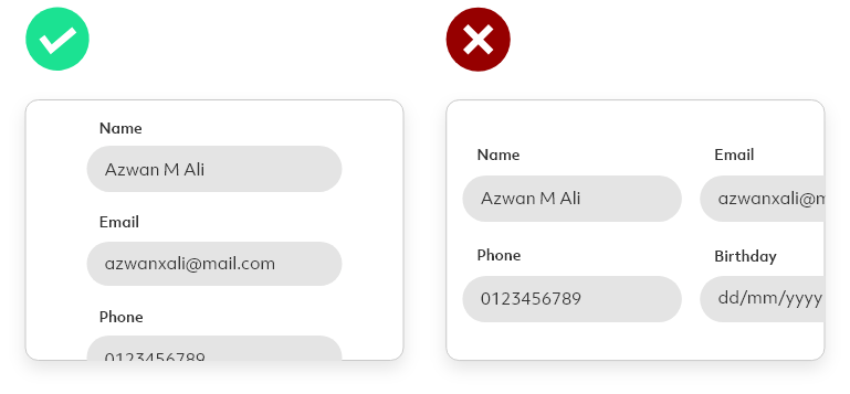
a. Use one column
A single-column design helps users to focus on one section at a time, allowing users to follow through and ultimately complete the form. This works best, especially for longer forms.
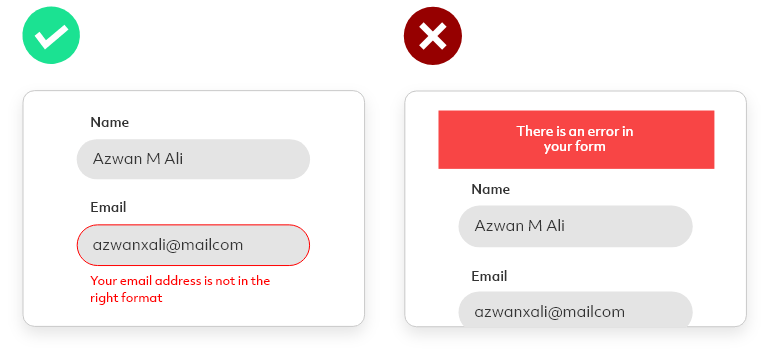
b. Display "error messages" clearly for each form field
Avoid displaying a general error message on the form as it does not guide a user to the specific form field which needs amendment. Instead, place an error message in red at the bottom of a text field to indicate the error.
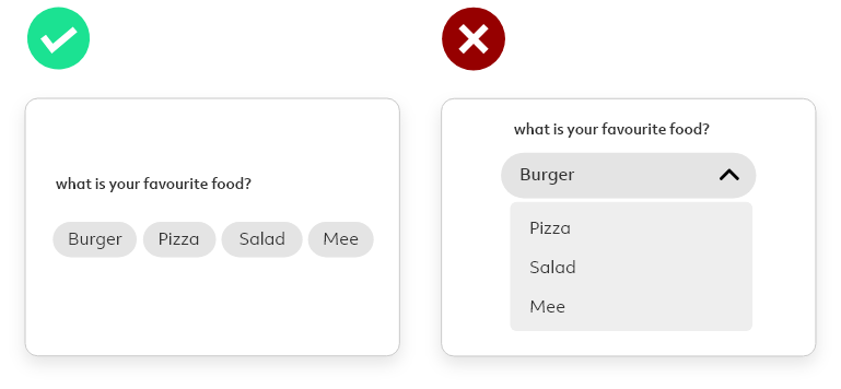
c. Show all the options upfront if there are less than 5 options to choose from.
If creating an option form with less than 5 options, consider placing all of the options upfront instead of using a dropdown menu. This simplifies user action from 2 steps to 1 step.
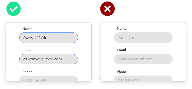
d. Align text to the left
As we naturally read from left to right, all labels, placeholders and descriptions should be placed on the left. Left alignment helps the eye move from one line to the next in a predictable way, improving readability and reducing form completion time.
e. Auto-fill
Auto-fill can be an efficient assistant. Data like name, address, email, and others can be stored in the cache. By integrating auto-fill, it will help users complete the form faster.
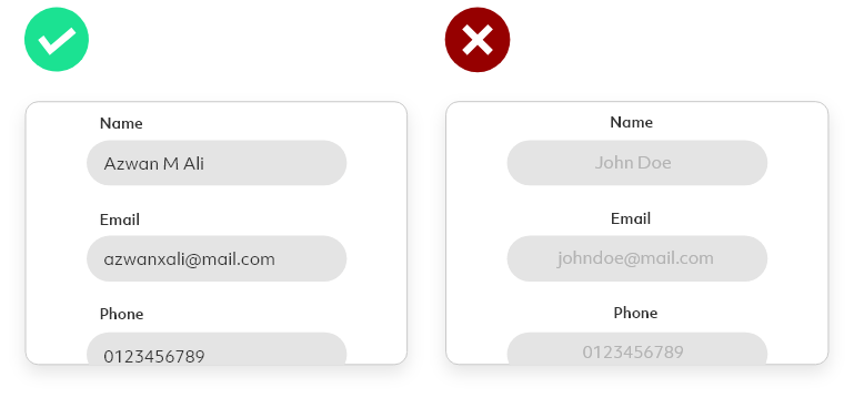
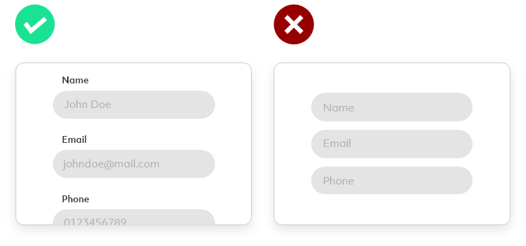
f. Avoid using the label as the placeholder text
Users use the placeholder as a hint on the information required. So, replacing the placeholder with the label (i.e. Name) may cause confusion as users are relying on their short-term memory to fill in the information.
By implementing the above lead form design best practices to a lead form, visitors will experience a more reliable and seamless experience. The better the experience, the more leads acquired and ultimately more conversions and sales will follow.
If you would like to enquire or learn more about our UI/UX services, drop us an email at hello@admiral.digital.