
Call-to-Action or CTA buttons are a vital element in the world of digital marketing. Not only does it encourage clicks, but it also gives businesses an opportunity to bump up their conversion rates.
It encourages and guides people to perform an action based on a desire for the brand. However, does the design of a CTA button affect one’s action?
Before we dive in on this topic, there’s one thing to keep in mind. A CTA button generally consists of two design elements: the design and the copy. The copy encourages people to know more, whereas the design guides the users where to click.
Here’s an example – say a clothing brand is running a sale ad on Facebook. The copy that says ‘20% off’ is the element that entices people to want to take advantage. Meanwhile, the CTA button is the guide to where audiences can receive the 20% off.
Since we know CTA guides users to take action, they are very important when driving conversions.
Ready to know more? Here are 6 CTA best practices to apply when designing a CTA button.
No 1:
Choose Highly Contrasting Colours
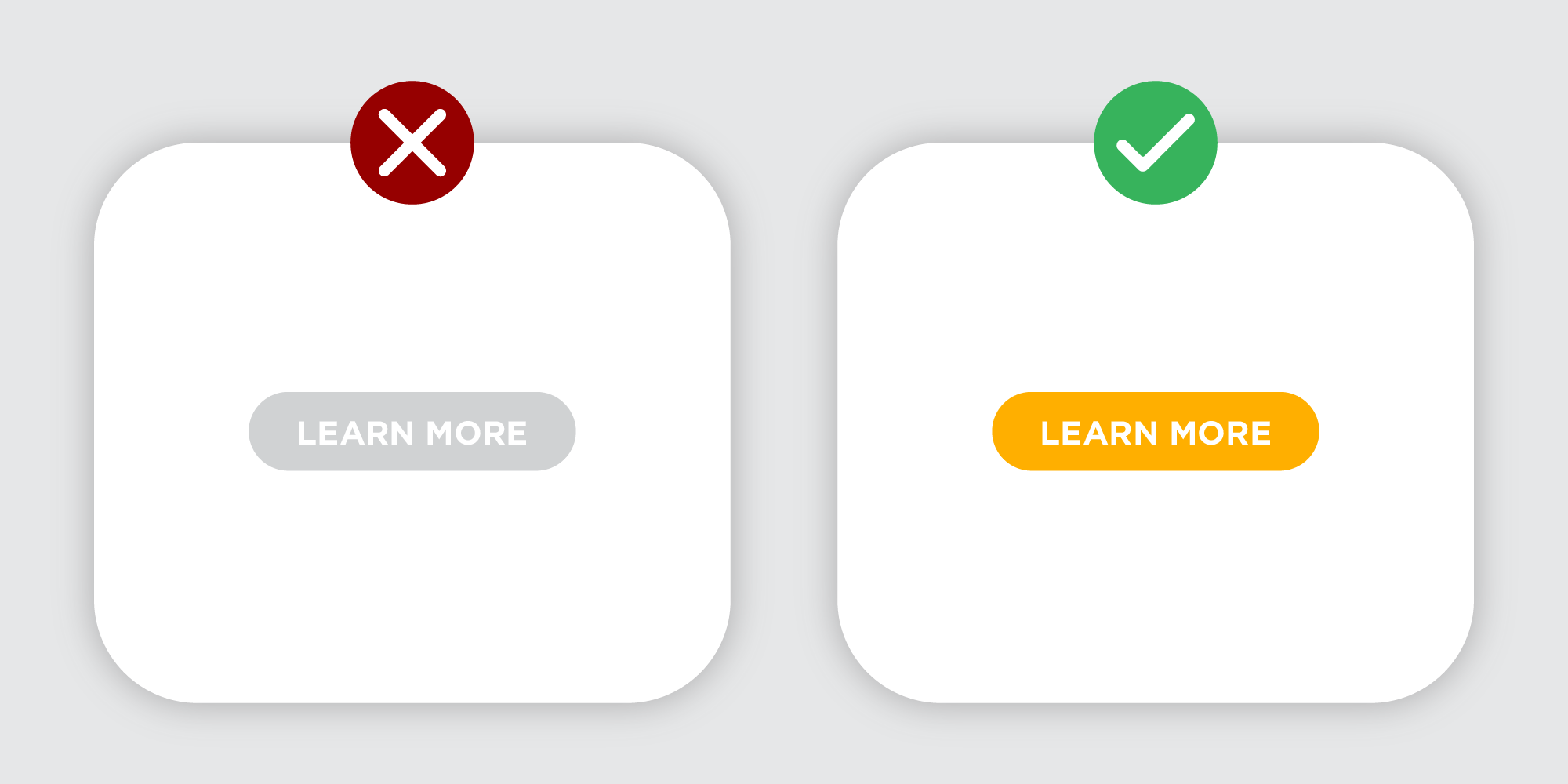
When designing a CTA button, make sure that it stands out on the banner being created. Remember, this is the key element because the more likely a user is to click the CTA button, the higher the potential for sales conversion.
The best practice would be to use a contrasting colour for the CTA so that it stands out and gives the audience a guide to know where to click. Even better if the colour used isn’t utilised anywhere else in the design.
No 2:
Use Appropriate Sizing

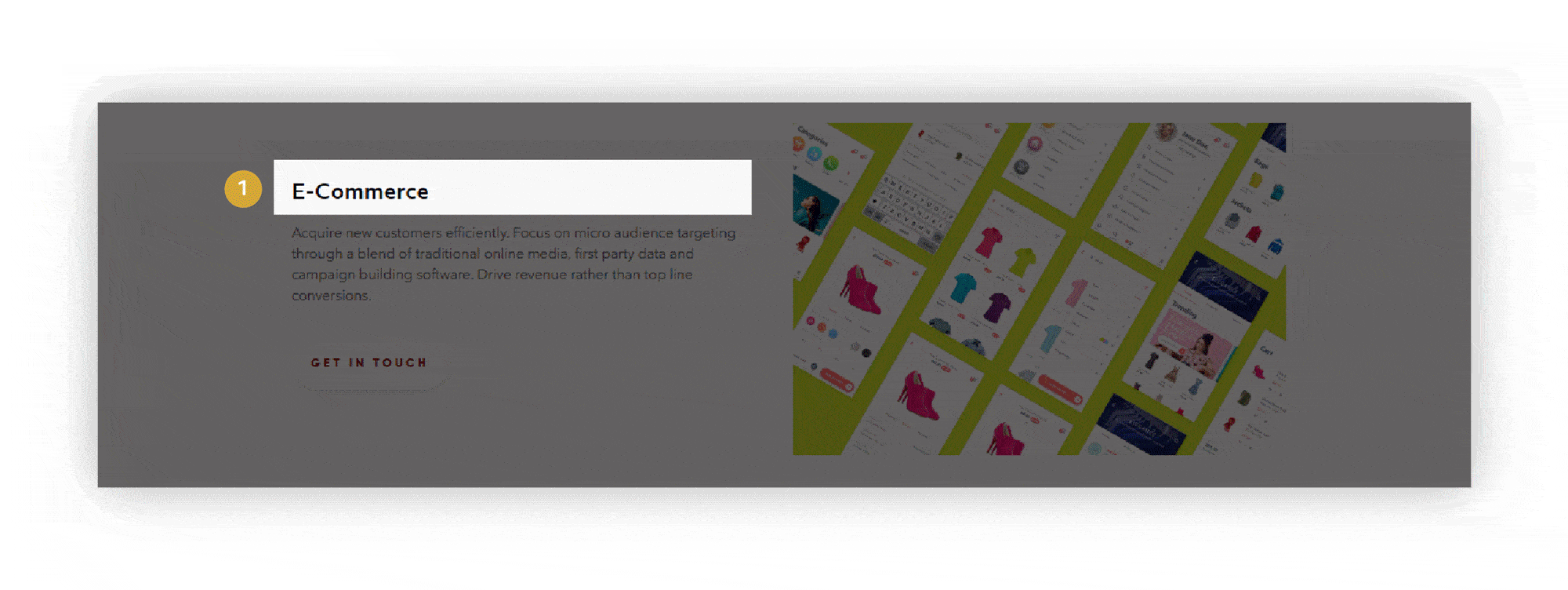
Conventional wisdom states that the bigger the size, the more noticeable the CTA button. While it does seem logical, it’s better to keep buttons aesthetically pleasing. To do so, one must follow the rules of visual hierarchy, especially in terms of composition. The CTA button should be reasonably proportionate to the entire layout.
For instance, the size of the CTA button should be large enough for people to read its contents, but it shouldn’t take over half of the design nor should it be larger than the rest of your visual copy. Otherwise, the design will be too visually overwhelming and viewers might be distracted and unsure of what elements to focus. In that case, ads may result in low click-through or conversion rates.
No 3:
Leave Enough White Space

The infamous ‘white space’, or also known as ‘negative space’ or ‘dead space’, is the area that sits between the elements of a visual composition. Serving more than just a background, it also acts as an important tool in emphasising particular elements in a design such as the CTA button — allowing it to stand out from the other design elements. A great tip to keep in mind is to always avoid cramping design elements too close to one another as this reduces readability. Hence, remember to provide appropriate white space between where it’s needed to improve focus and to also create a better comprehension of the offer. For more in-depth guide to visual hierarchy, read our article about it.
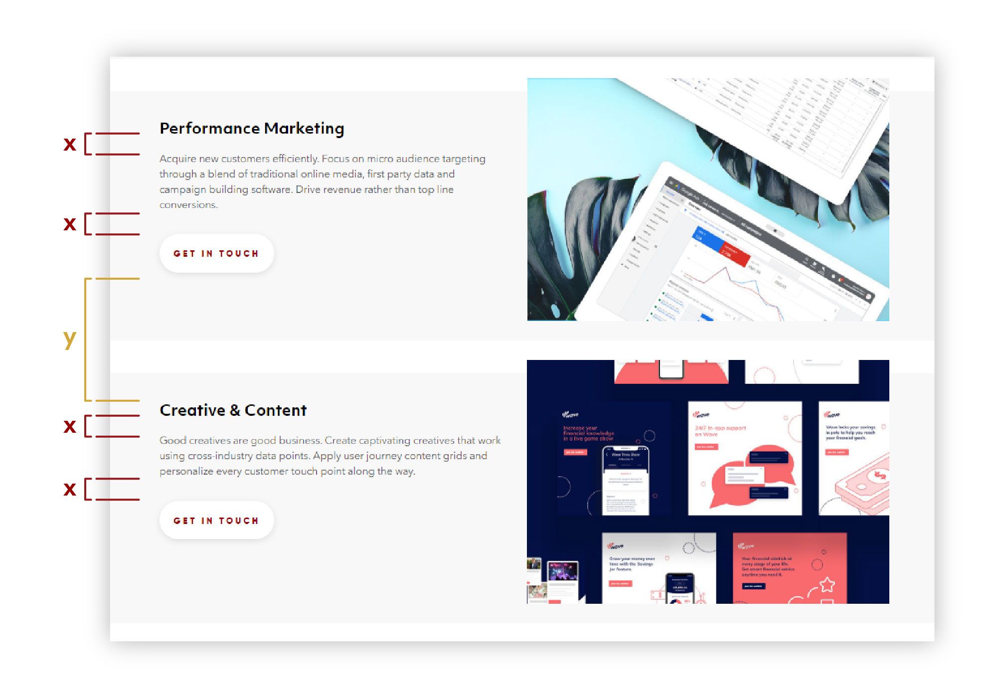
When an appropriate amount of white space is applied within a composition – it can also help build or separate a connection between different design elements. Let’s take a website design as an example, when you apply the same amount of dead space in between the header, sub-header and the CTA – it sets as a guide – allowing viewers to understand that all the design elements they’re looking at forms a particular section. If there is a large amount of white space, it means that the viewers have entered another section.
No 4:
Simple and Clear Copy

CTA copy should drive users to take action. The idea here is to get people to click through the ad in the least amount of time possible. So how do you create an effective CTA? First, you should determine the goal you want to achieve because once you know what to do, you can think about how best you can do it. Here are a few examples to define your goal:
- Are you looking to encourage sales?
- Move viewers to another content piece?
- Increase subscriptions?
Often times, the best CTA copies are brief strong verbs such as:
- Book Now
- Join Community
- Buy Now
- Learn More
- Start Adventure
A good CTA copy is straightforward, it should tell the viewer exactly ‘what’s in it’ for them and if possible, it should be no longer than three words.
No 5:
CTA Placement

CTA placement plays a crucial role, especially if a brand is looking to bump up clicks and conversion rates. So, what are CTA placement best practices? First, we must understand the user’s mental model and secondly, the user journey.
Mental Model
The mental model is an overarching term for any sort of framework, concept, or worldview that one carries around in their mind. For instance, when people are looking to go back to a website’s homepage, they’d naturally click on the brand’s logo. Similarly, when someone is looking to sign-up for an account, they’d normally look at the top right of the website. In short, mental models are formed through the frequent use of a system and the understanding of how it works. By recognising this, UI designers can place CTA buttons at the ideal place on the screen for maximum readability.
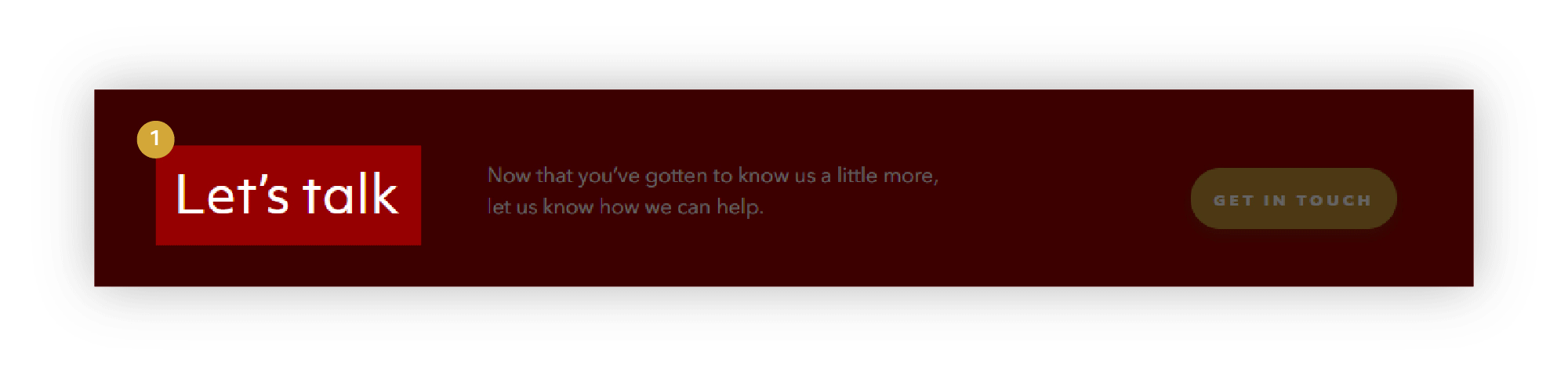
Reading Flow
Reading flow is another way to help determine where to place a CTA. Ideally, users should be guided to take immediate action once they’ve finished reading a statement. This statement could be on the website banner, an ad’s visual copy, or a section in an email. The CTA should be placed after a statement that indicates what the readers will get. For instance, after reading a website banner or an ad, there’s a CTA button that will lead viewers to ‘learn more’, ‘buy now’, etc. By doing so, brands can generate more leads or bump up conversion rates!
No 6:
Test and Re-test
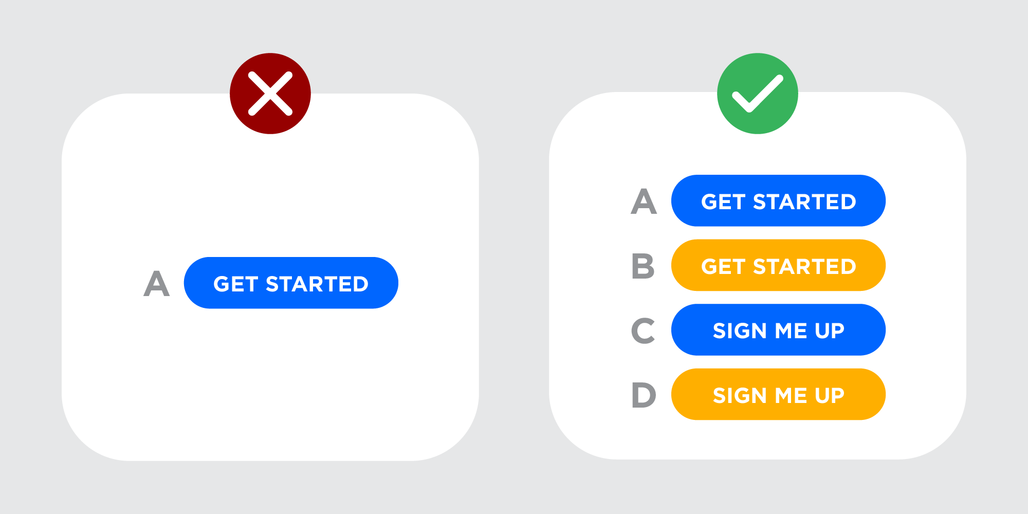
Once the design elements and placement are settled, the next step is to see if it’s working. How do performance marketers test an ad’s effectiveness? One way is A/B testing. A/B testing is the process of comparing two versions of something and measuring the differences in performance. Only one variant should be tested at a time, however. For instance, if the CTA design is not eye-catching enough, try changing colours, such as blue to yellow, as shown in the image above.
Once it’s been determined what the variant should be, send the original to one group and the variant to the other. By doing this, each variation can be monitored for performance. The end result will reveal which marketing asset works better. With this, better design decisions can be made when it comes to ad copies, web design, and more as it is not limited to CTA.
A well-designed CTA can be a great turnaround tool for campaigns – especially when they appear in relevant formats like email banners, Instagram story ads, on a website and more. With these guidelines in place, any performance marketer can boost engagement and conversions in no time.
Does your brand’s website need an Facebook/Google ad audit to determine its effectiveness? If so, let us by dropping a note to hello@admiral.digital.