

Visual hierarchy: make information easier to use
Use typography, contrast, size and space to help people understand content and find an appropriate next step.

Visual hierarchy gives information an order. It helps someone recognise the subject, find the important details and understand which action to consider next.
Begin with the content's priorities
Decide what the visitor needs to understand first and what supports that understanding. A product, article and application page will not necessarily share the same priorities.

The comparison shows how different emphasis and grouping change the route through similar information. Hierarchy is useful when it makes the content easier to follow, not simply when it makes one element impossible to miss.
Use typography to distinguish roles
Headings, paragraphs, labels and captions need recognisable roles. A small, consistent set of type sizes and weights can communicate those roles without creating a separate style for every sentence.
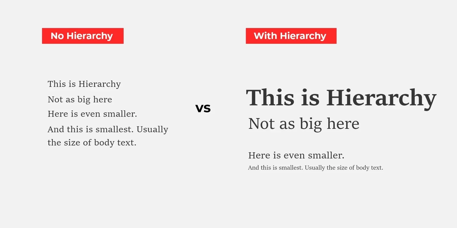
Keep the relationship between visual and semantic structure. Text styled as a large heading should also use the appropriate heading level in the page. Do not rely on bold type alone to communicate structure to every reader.
Use size and contrast deliberately
A larger element often receives more attention, but maximum size is not always the right choice. An oversized heading can push the useful information and actions too far down a small screen.
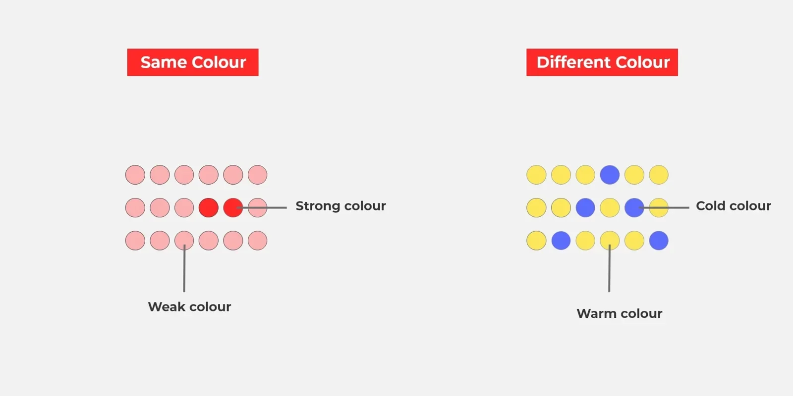
Colour can distinguish an action or group related information. It should not be the only way to communicate a status or difference. Make text and controls readable in their actual backgrounds and states, including focus, errors and hover where available.
Give related information appropriate space
Spacing helps people recognise which label belongs to a field, which details describe a card and where one section ends. Adding space indiscriminately can also make a page feel disconnected.
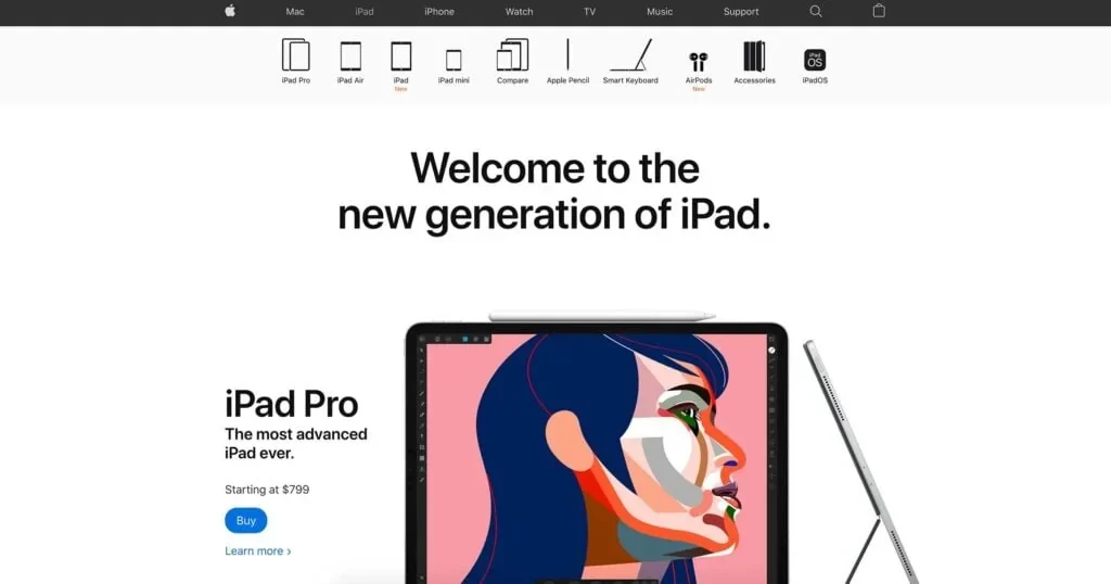
Use consistent spacing rules and adjust the composition when the viewport changes. A desktop arrangement should not become a long sequence of oversized mobile gaps merely because its columns stack.
Let the action follow the explanation
Place a relevant call to action where the reader has enough context to evaluate it. The strongest visual emphasis should support the task, not compete with it.
An article may need a clear reading flow more than a repeated sales button. A product page may need an understandable purchase action and supporting delivery information. Our CTA guide looks at these decisions in more detail.
Check the hierarchy in real conditions
Review the page on a small screen, with long headings, enlarged text and a keyboard where forms are involved. Check whether content still appears in a logical order without its colour or imagery.
Use observation and feedback to find what people miss or misunderstand. Reading patterns are context-dependent; an F-shaped or Z-shaped diagram is not a guarantee of where every visitor will look.
A good hierarchy makes important information apparent while leaving the rest accessible. It is a practical part of UX/UI design, not a decorative layer added after the content is finished.



What would you like to achieve?
Tell us what you want to change. We’ll help you find the right starting point.