
Introduction
Looking at the image below, between screen A and B, which screen is more eye-catching than the other? Which screen gives a more direct definition of the title, subtitle, and the content?

Ding ding! Yes, it’s screen B! Why?, It’s simply because Screen B implements visual hierarchy principles in its design. Screen B scales up the size of the elements and tightly wraps the icons around the text, drawing the viewer’s focus towards the center of the image where the message is.
What is visual hierarchy and why is visual hierarchy important in graphic design? Keep reading to learn more.
What is Visual Hierarchy?
Visual hierarchy is the arrangement of graphic elements in a design relative to their importance. For example, a business card would have elements such as name, organisation, contact number, email address, and other contact information. Which out of all these is the most important element? What should the person look at first? More often than not, this would be the name of the organisation followed by the person’s name, job title, and lastly, their contact information.
This hierarchy is what guides a user’s attention to precisely the elements the designer intends them to. Implementing a visual hierarchy not only helps the reader process information in an easier way (because content is broken down for them), but also makes content more visually appealing.
These days, where the average human attention span is only 8 seconds, it’s crucial for designers to practice proper visual hierarchy in order to successfully create engaging content. This includes websites, apps and even social media content. With that being said, this article covers the golden principles that’ll help create aesthetically pleasing designs with visual hierarchy.
No 1:
Composition
Every piece of content should flow well. Always remember that the key is to guide readers through the content – from top to bottom. In order to get started, 2 main questions should be contemplated:
- Where does the viewer’s eye usually go to first when it lands on a website?
- What are the elements that will help guide focus onto the next point of attention?
Here’s when composition comes into play. Composition consists of all the separate elements to a design such as text, images, colour, and graphics. The composition principle helps arrange components based on 2 rules: reading pattern and the rule of thirds.
a. Reading pattern
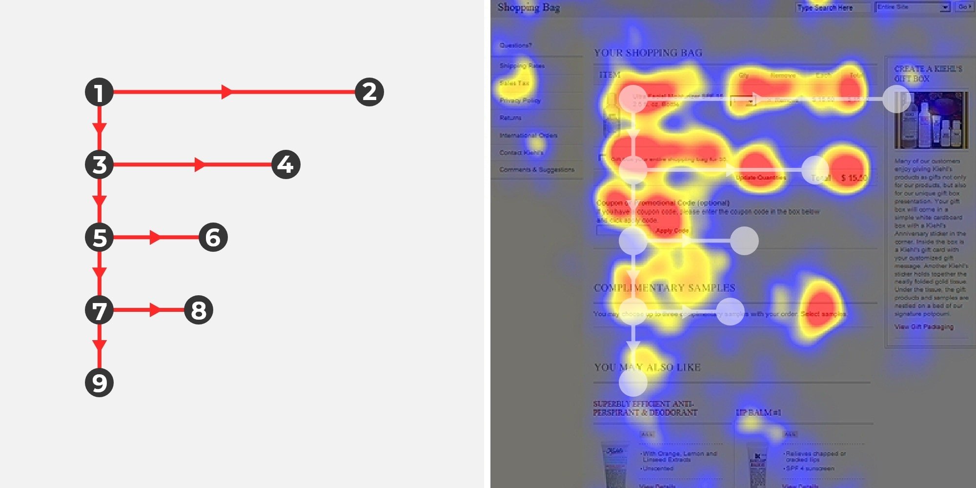
Most people read from left to right. When it comes to designing a page, there are 2 major patterns that help arrange information for better readability. For heavy-text components, all of the important information can be arranged in an ‘F’ pattern. The image below shows the heat map of how a typical reader consumes heavy-text content.
This composition pattern will help the designer to properly arrange important information so users can navigate the screen more efficiently.
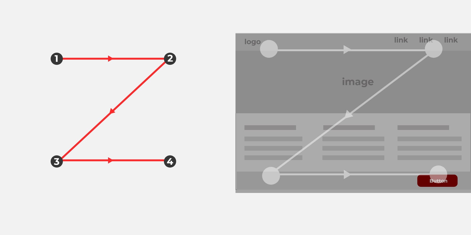
On the other hand, for landing pages that have minimal text, information should be placed that guides the eyes in a ‘Z’ pattern. This focus on simplicity makes the Z-Pattern uniquely suited for landing page designs – where you want a singular focus to draw people in and encourage them to take action. To do so, simply place the call to action along the Z path to make sure that the viewer sees it. By doing so, readers have a clear direction as to what information ro receive and action needed to be taken after. This can potentially lead to more conversions on a website.
b. Rule of Thirds
The rule of thirds can help determine where important information should be placed in a design. Again, it acts as a guide to the viewer as to where they should be looking first. The rule of thirds consists of two guides in horizontals and two guides in verticals. The crossover between those lines is the pin-point area where most of the users’ eyes will focus on. Make use of it by placing the main component (eg. text, subject) within this area. Most good layouts, even photos, implement this rule to get eye-catching results.
No 2:
Typography
Typography is everywhere we look, it’s in the books we read, on the websites we visit, even on the billboards, street signs, packaging and so much more. Simply put, typography is the style and appearance of text. Typography also refers to a combination of typefaces that could be similar or different in terms of sizes, elements, font family and attributes to convey a message on the screen. When creating hierarchy through typography, the best practice is to have 3 sets of components in mind in order to organise the designs.
The 3 main components are headline, a sub headline, and body copy.
Let’s take a look at the image below. Both texts comes from the same font family. Notice the difference between the two? It’s simply the visual hierarchy using contrasting font sizes to draw attention. Although users can still read through the paragraph on the left, they won’t be able to convey the importance of which is being highlighted.
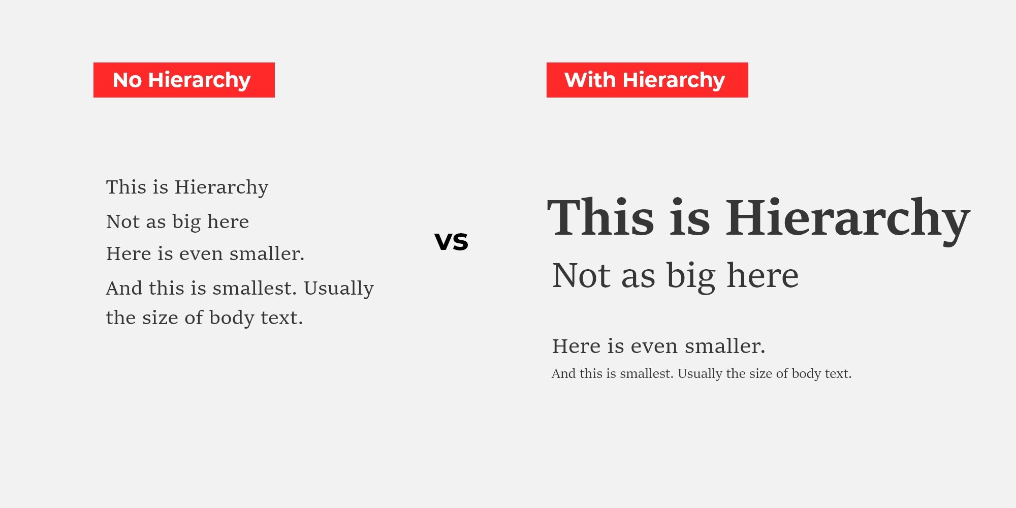
Meanwhile, the text on the right properly encapsulates the principle of visual hierarchy by clearly showing what the focal point is, but also leading users throughout the paragraph with less friction. It also has better readability due to looking much clearer.
No 3:
Size & Scale
When it comes to design, size does matter. Bigger text or shapes tend to give a perception that they’re important as they demand greater attention. However, it’s very important to choose the correct element to highlight otherwise it will be a distraction – which is something that should be avoided.
One technique is to narrow down which message you want the audience to specifically focus – and then make it big. This way the message is being conveyed more effectively.
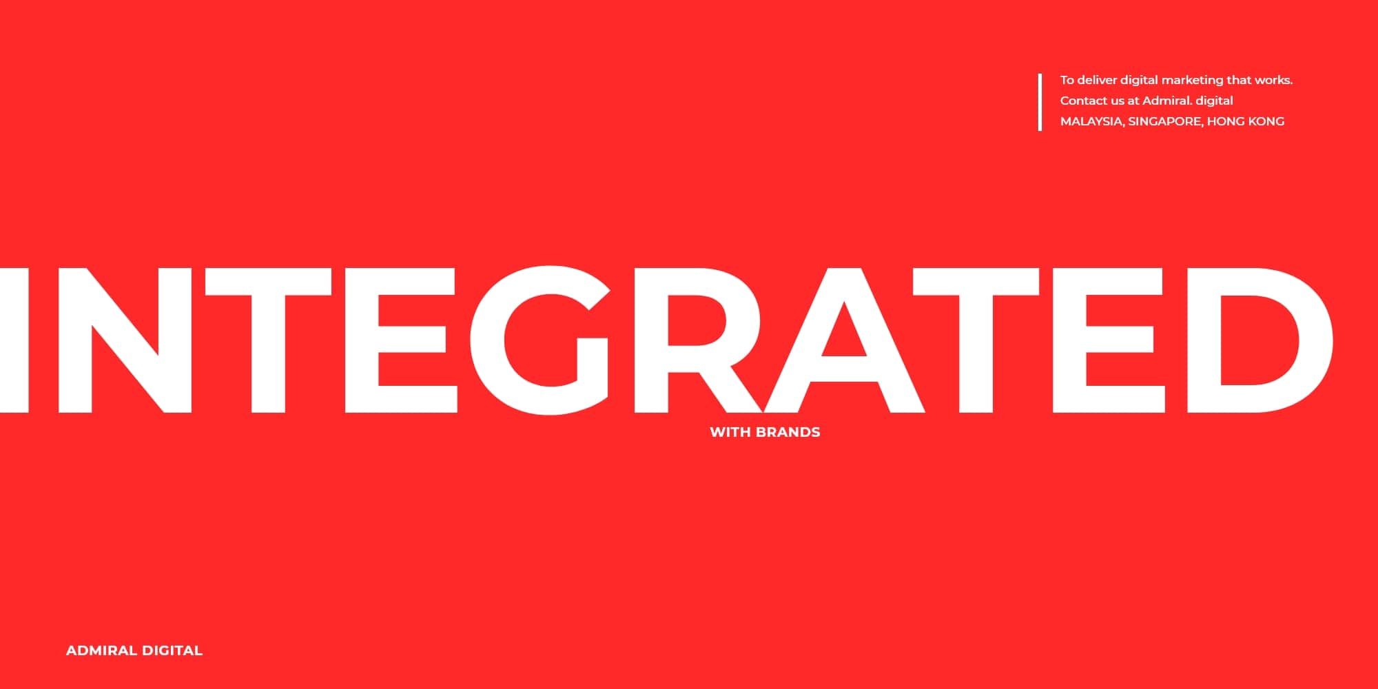
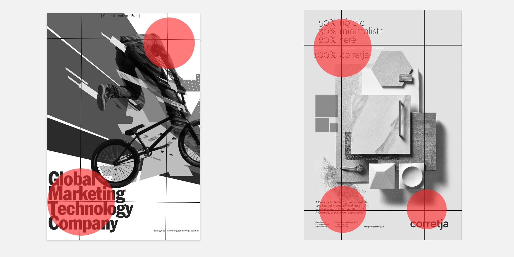
As an example, the visual above consists of a huge text right in the middle of the image. But because the word “Integrated” creates curiosity – viewers tend to look for ‘answers’. They will scan the text situated on the top right of the image to the bottom left. This is an example of executing the principle the right way.
When it comes to shapes, different sizes can create perspective and depth of field when placed correctly. This also helps determine what readers should focus on when they look at it. Time Magazine and The New Yorker make such good references with their illustrated covers. For instance, this 1954 cover of Times Magazine features Walt Disney on its cover image. It’s easy to notice that the focal point is Walt Disney himself and the cartoon characters are drawn in a much smaller scale behind him. This cover gives readers an idea that the main story for this issue is about him.
Or take a look at The New Yorker (April 2020 issue), where the central focus illustrates a nurse on a video call with her family back home.
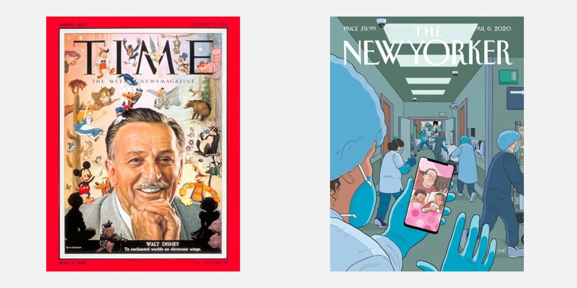
Source : Time Magazine “Walt Disney” 1954 (left), The New Yorker “Bedtime” April 2020 (Right)
No 4:
Color & Contrast
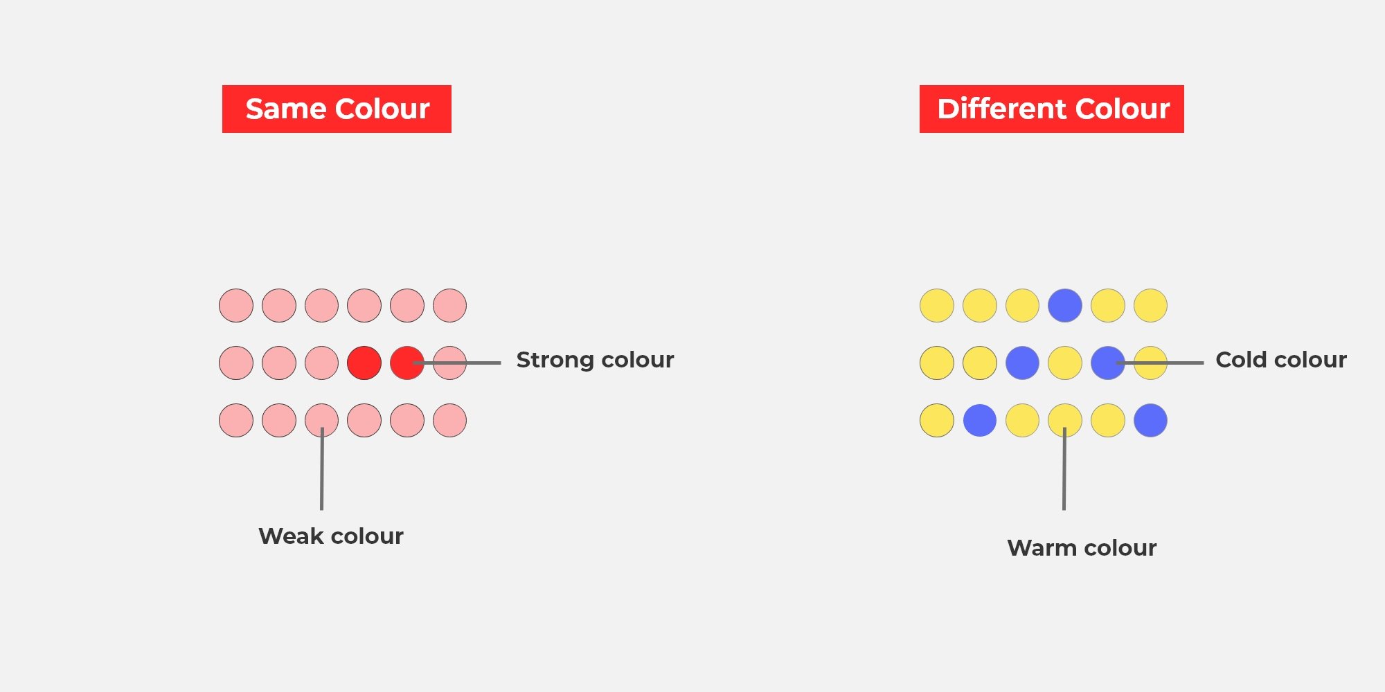
Colour choice and contrast are essential for visual hierarchy as they help users to distinguish the core elements. It’s commonly known – colours have the power to influence a user’s emotions. For instance, when a user sees warm colours such as yellow and orange, it creates a sense of joy and liveliness. Meanwhile when a user is exposed to cool colours such as blue and purple, it gives off a calm and relaxed feeling. This is called colour psychology. Now, the colour attributes can be divided into two:
- Strong/bold colour: red, yellow and blue
- Weak colour: pastel colour that is normally used to complement the bold colour.
Bold colours are easy to notice and can be used to highlight objects or set a contrast for the design. Take a look at the example below. The same can be implemented with the same colour by combining both the bolder colour and the weaker one together to show connectivity or alternatively, two contrasting colours can be put together to really bring out the difference.
Here’s another example. See how the major CTA buttons like “Sign Up Free” and “Sign Up” are in a different colour compared to the “Login” button? That’s because most people who land on this page are most likely people who do not have an account. Hence, to get them to have one, Mailchimp sets out a clear direction to where new users can sign-up by using contrasting colours to make the CTA buttons stand out more.
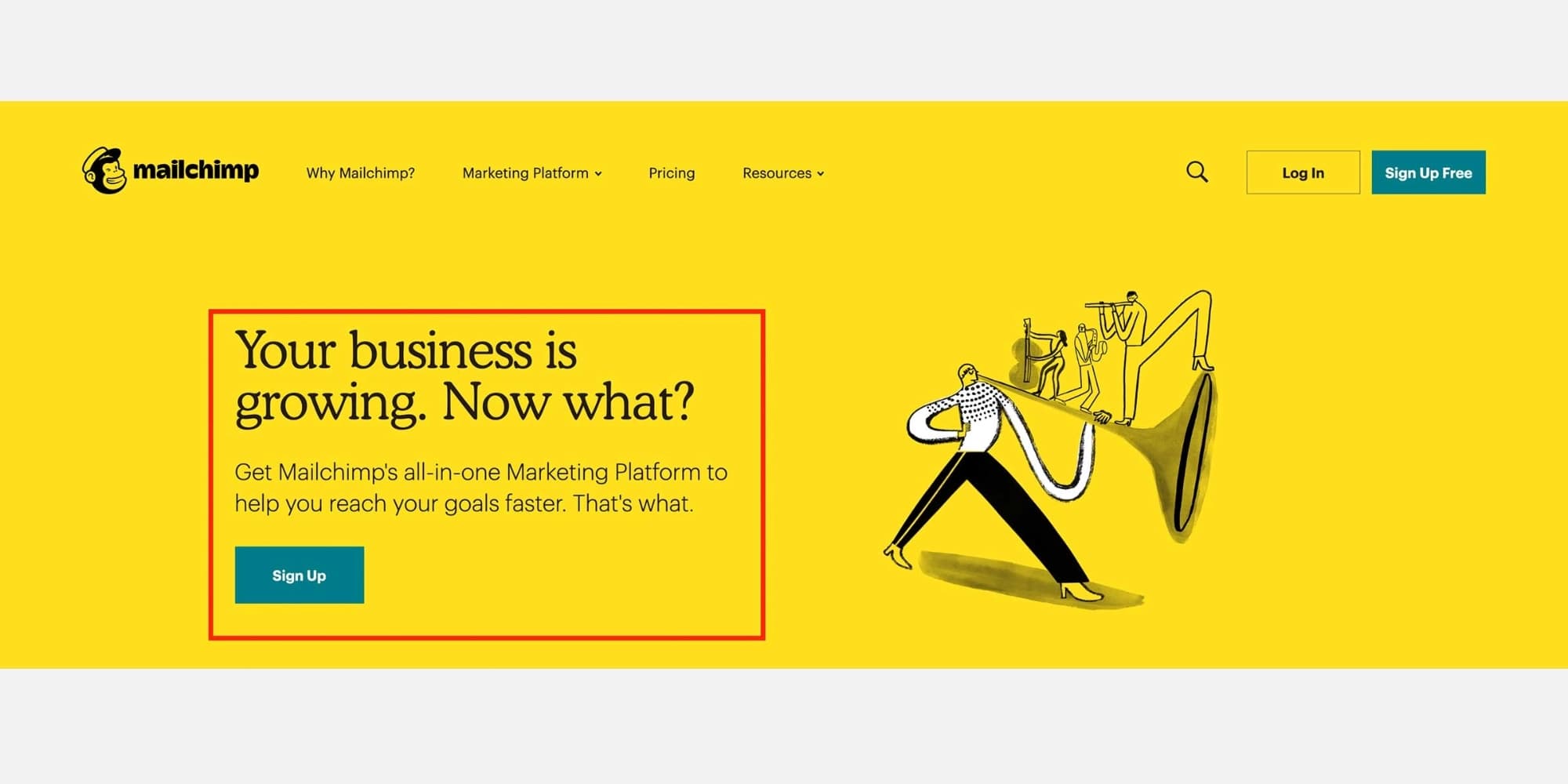
Source : Mailchimp
No 5:
White or Negative Space
A cluttered website can be distracting and unpleasant to the eyes. Hence, taking advantage of the white space can provide balance on the overall design. It encompasses breathing space for your eyes to relax and enhances the flow of perceiving the screen to get users eyes back into focus. By implementing the right amount of white space, it helps the readers to stay on the screen and absorb important information directly. Additionally, with a good amount of white space, it actually helps the user’s eye to relax – especially after scrolling through a heavy text page. Look at the example below:
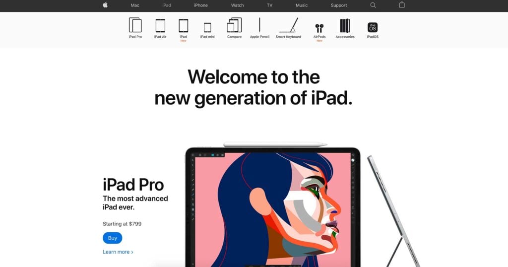
Source : Apple website
Closing thoughts
A designer’s top priority or purpose (especially for a UI/UX designer) is to create a space where information is easily absorbed. It’s not about implementing fancy stuff all the time as you don’t want to create more distractions for readers. With that in mind, designers must always remember the crucial role of the 5 principles discussed above when designing screens. With the power of visual hierarchy and a great design sense – anyone can systematically solve a design problem.
If you are interested in us helping you out with your UI/UX design, we would be delighted for a quick chat. Drop us a note at hello@admiral.digital