Table of Contents
It takes a mere 50 milliseconds for a user to decide whether or not to stay on a website. This is the main challenge faced by anyone learning to build a website for their business. How do you grab people’s attention through design?
Don’t worry, our definitive guide will help web designers at any level of experience methodically and optimally build an eye-catching, conversion-generating website for both B2B and B2C businesses.
Step One: Determine the purpose of the website
There are 3 main types of websites:
- eCommerce – Websites that sell products directly to consumers. Visitors can browse products and purchase items through online payment methods. Mostly used by B2C companies.
- Lead Generation – Websites that collect contact details from visitors. Mainly for B2B companies who offer consultation services that must be negotiated rather than purchased outright.
- Portfolio – Websites that showcase their products without directly selling them on the website. Preferred by B2B or luxury B2C brands who mainly market through brand image and storytelling.
- Increase total visitors
- Increase average time on site
- Provide a better user experience
- Achieve high numbers of return visits
- Spread brand awareness
- Enhance customer experience
Step Two: Structure the website’s architecture
Before the foundation of a house is built, the first step is to plan. Designing a website is no different. Like an architect, a web designer must first determine what types of pages are going to be on the website and how they should be structured for the best user experience. Following which, they should implement a consistent URL structure to allow search engine crawlers and visitors to easily navigate the website.
Consider the types of pages usually found on business websites:
Main page types
- Homepage – Acts as a brand’s storefront. It should feature appealing headlines and high impact copy to entice users to browse the brand’s products and services.
- About page – Shares the brand’s story with visitors, including company history and the company’s mission and vision to give visitors a sense of the brand’s personality.
- Contact page – Gives visitors ways to connect with the brand such as phone number, mailing and email addresses, and a GPS map location. Keeping contact forms short and including schema markup so search engines can find the business easier are useful tips for this page.
- Product category pages – Displays collections of products to help visitors narrow down the products they’re interested in. Best practice: If using a grid layout, display no more than 4 items per row for desktop, or 2 per row for mobile.
- Product pages – Gives individual information about each product including features and pricing. Typically includes a prominent call-to-action (CTA) such as “Buy now” “Add to cart” “Speak with us” to drive customers to purchase.
- Shopping cart / Checkout / Payment gateway – Each of these pages are steps towards getting the customer to purchase the product in a speedy manner.
Supporting page types
- News & Blog section – Sometimes separate, sometimes combined, this section is where visitors can read the latest news about the brand or gain insights through branded thought leadership articles.
- FAQs – A collection of commonly asked questions and their respective answers to help visitors find specific information about various aspects of dealing with the brand.
- Testimonials – Can be incorporated on multiple sites or be a standalone page, but mainly displays positive client referrals to your audience.
- Policy pages – These can include terms and conditions, privacy policy, cookie policy, and other pages that provide legal information to ensure compliance.
- 404 Error page – This page is often forgotten but important. It redirects broken links or mistyped URLs to a branded error page that should contain friendly messaging.
Optimal URL structuring
Once the types of pages have been determined, creating a site map or wireframe of the entire website is needed to design URL structures and the overall customer journey. To properly design a sitemap, the following steps should be taken:
- Use Microsoft Excel or Google Sheets to map out and plan URL structures in a spreadsheet.
- Categorise the content into groups.
- Add URL names and keep them simple and short.
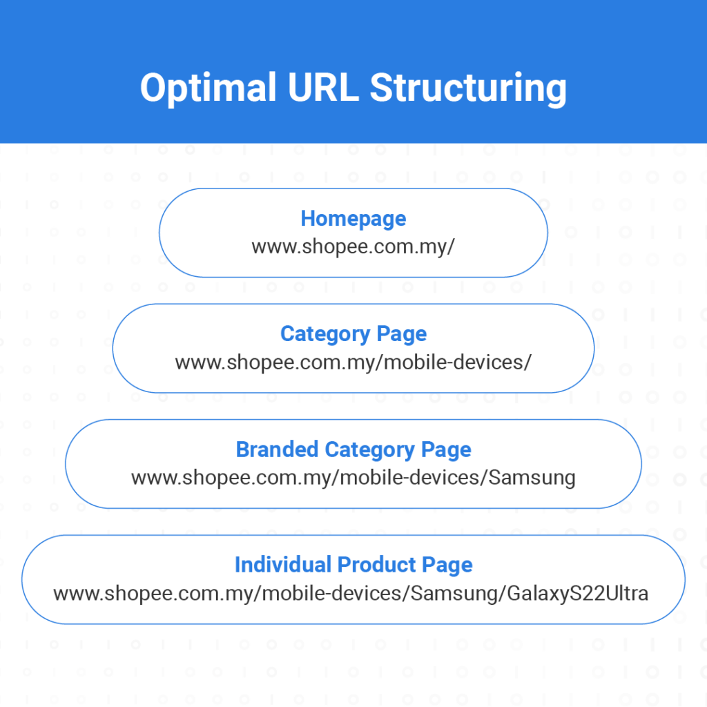
The example below shows how URLs should flow from the main website to all of the other pages. Notice the URLs are organised in such a way users can always understand where they are in a website.
Step Three: Designing a website
48% of people cited a website’s design as the number one factor in deciding the credibility of a business. (Techjury)
Website design philosophy revolves around strategically balancing how the brand wants to present itself with what the audience wants to see. The end goal is the same – to design a website that will resonate with the brand’s target audience and drive traffic, engagement, and conversions. Even if designers have their own ‘eye’ for what is aesthetically pleasing website design, there are several important principles to keep in mind.
Key design principles
- Simplicity – Site design should be clear and understandable. In fact, 84.6% of web designers say overcrowding a website is the most common design mistake. Therefore, a minimalist design approach is advised.
- Consistency – For content, the information should be up-to-date and brand relevant. For design, components such as the layout, colours, fonts and formatting should be the same across every page of the website.
- Easy navigation – It should be easy to move from one page to another and for users to complete actions such as reading an article, purchasing a product, etc.
- Responsive design – Websites should be easy to use and visually attractive on all devices, whether it be mobile, tablet, desktop computers or laptops.
Design process
Next, let’s go over the design process for a website. Regardless of a team’s size, budget, or time requirements, these steps are necessary to properly design a website.
- Research – First, look at the brand’s competitors and go through each of their websites and social media accounts. The goal isn’t for the designer to copy what they see, but rather to gain inspiration and decide what direction they want to head in.
- Choose web design software – The most popular desktop apps for website design are Adobe XD and Sketch.
- Begin building – Start choosing some of the visual and functional elements that are most suitable for the brand.
Web design elements
Methodical web design takes into consideration all of the components of a website. The designer should be able to provide an effective design solution or adjust existing preferences for each element. These elements include:
- Layout – One of the most fundamental aspects of the website, layout determines the arrangement of all of the elements on a page. A good layout is intuitive to use and easy to navigate.
- Images – Any graphics, pictures, photographs, icons, or other symbols that add creative value to the page and provide irresistible visual stimulus to keep users on the page.
- Visual hierarchy – Arranging graphical elements on a page based on their importance. This helps guide a user’s eye to the places where brand messaging can be communicated. An in-depth guide to visual hierarchy can be found here.
- Colour scheme – The combination of colours used on a website are intrinsic to creating the mood and energy the brand aims to emulate. Designers should select a dominant colour along with a few others to create a colour palette. Colour palettes can be either monochromatic (different shades of the same colour), analogous (3 colours that are next to each other on the 12-spoke colour wheel), complementary (opposite colours), or triadic (3 colours equally spaced around the 12-spoke colour wheel) colour schemes.
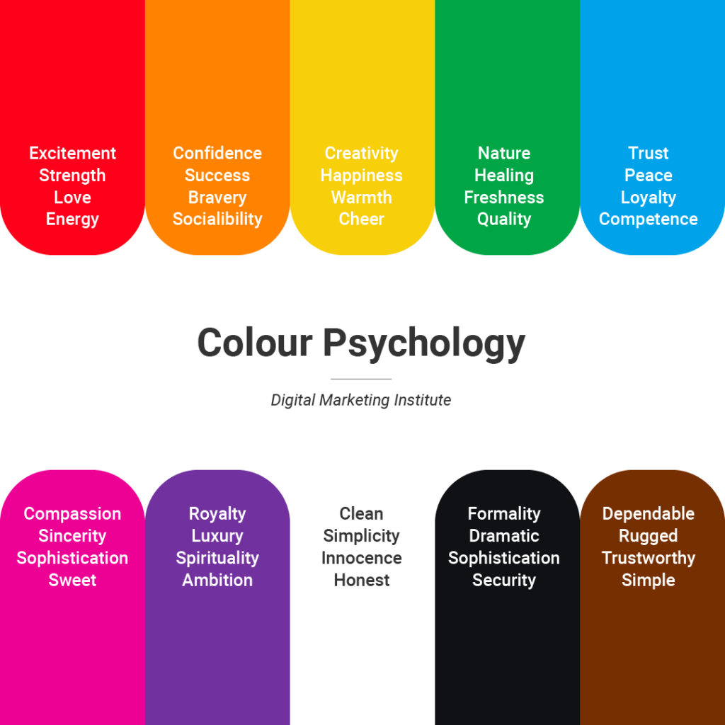
In addition, colour theory recognises the concept of colour psychology – that certain colours trigger specific emotions which can lead to taking specific courses of action. The colour chart below shows which colours are linked to which feelings:
- Typography – Arguably one of the most important elements of the website is the typography used. It’s best to use no more than three fonts throughout an entire site for consistency and readability. Based on a brand’s industry, positioning, and target audience, web designers should choose an appropriate serif or sans serif font.
- Readability – Priority should be placed on ensuring visitors can find information as quickly as possible. According to Hubspot, 42% of people will leave a website because of poor functionality.
- Navigation – These elements can be in the form of menus, buttons, or links on every page throughout the website. Navigational elements should guide users to the action they want to take, whether it be to visit a section of a site, buy a product, or leave contact details.
- Content – This will be explained further in the next section.
Step Four: Executing a content strategy
Content gives brands the opportunity to share the benefits of their products and services while differentiating themselves from the competition. Regardless of how aesthetically pleasing a website is, a proper content strategy is needed to drive curiosity, interest and purchasing intent by visitors.
Furthermore, implementing a content strategy has key benefits.
- Grows brand awareness
- Helps recruit brand ambassadors
- Improves search engine rankings (SEO)
- Generates new business leads
- Educates the audience about products
How to write effective content for a website
Throwing all the sales-related jargon one can think of onto a page does not make it more effective at driving conversions. Since audiences are bombarded by advertisements and sales messages from every facet of their lives, the ability to convert a message into a sale is more challenging than ever before.
There are four qualities of highly effective content:
Relevant – Content must be closely connected to the audience’s intended goals for visiting the website. When examining content, writers should ask themselves questions such as: What is the purpose of this content? What business outcome will it likely produce? Why would this content appeal to my audience? What actions will they take after reading it? These questions will ultimately determine the value of the content being examined.
Personalised – Acknowledges the audience’s point of view or preferences adds a personal touch that helps develop a positive affinity between a brand and its audience.
Valuable – Addresses the audience’s needs or interests. Effective content identifies the audience’s pain points and offers appropriate solutions to deal with them. This builds trust which leads to customer loyalty.
Actionable – Includes a clear CTA so that customers or potential leads can easily transport themselves down the conversion funnel towards a purchase or action. Effective content must provoke the audience into taking the desired action.
Creating a buyer’s persona
Now that we’ve determined the qualities of effective content, we can move on to determining the traits and characteristics of the target audience. This is called building a buyer’s persona.
A buyer’s persona is an imaginary representation of a person who would be interested in a particular brand’s products or services, based on research and data. Copywriters use buyer’s personas to visualise audiences and think of the best way to effectively communicate with them.
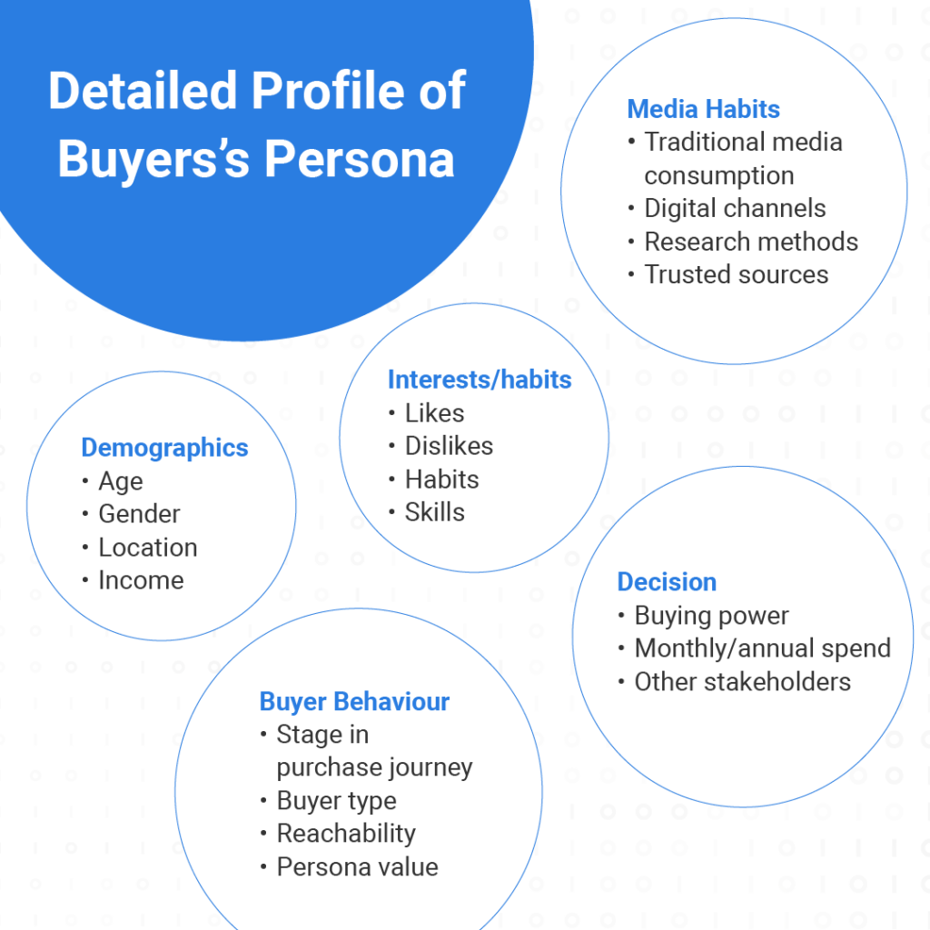
While it’s up to the marketer as to how detailed the profile will be and how to leverage this information, the categories below offer a comprehensive benchmark.
Conducting competitor analysis
One of the best ways to identify what kind of content a brand’s audience engages with is to analyse rival brands who sell similar products or services. This can be done by browsing competitor’s social media posts, website, email campaigns or paid/organic ads. The goal is not to copy or imitate rival brands, but to observe what they’re doing right and wrong and decide whether to implement something similar.
This process is known as social listening and there are various tools to help marketers hone in on competitor strengths and weaknesses. While conducting this research, it’s important to ask questions such as:
- What are their search engine rankings?
- How are they performing on social media in terms of followers and engagement?
- How is their feedback from customers?
- How do they make use of backlinks, internal links, and call-to-actions?
- Is their website optimised?
- What’s their tone of voice or style?
- What channels do they use?
Answering these questions about their rivals will allow marketers to gain the most valuable insights from the research conducted.
Researching keywords for SEO
If the goal is to drive traffic, then conducting keyword research is vital in understanding users’ search patterns and intentions. Furthermore, traffic metrics such as monthly volume, difficulty, organic click-through rates, and priority can be ascertained.
Tools such as Semrush, Ahrefs, or Google’s own Analytics, Search Console, and Keyword Planner help marketers research keywords which can be narrowed down to keyword groups and distributed throughout the website. This topic is further explained in our website optimisation section.
Finally comes writing!
Once the writer has determined the purpose of the content, conducted competitor analysis, and researched keywords, they may finally begin to process the data and start writing. This is not a simple task, as each page may have its own requirements and messaging depending on the type of page and course of action desired.All of a website’s copy and visual elements should reinforce the brand’s identity, and arouse interest in its products or services. To learn more about brand identity, read our previous blog Harnessing Brand Identity in Digital Marketing Campaigns.
Step Five: Optimising a website
Website optimisation comes after a web developer has created a basic mockup or prototype of the intended site. At this stage, user experience strategists and user interface designers work together to ensure all of the aforementioned design principles are applied in the most cohesive way possible. This is also when web developers tackle the issue of device compatibility, mobile responsiveness and page load times.
What is User Experience (UX) and User Interface (UI)?
User experience is defined as a person’s perceptions and responses resulting from the use of a product, system, or in this case, website. Anything a user interacts with on the page affects user experience and ultimately, the customer journey. Therefore, in order to drive traffic and conversions, an intuitive UX is indispensable.
User interface is the platform that users interact with and the individual elements that make up the platform. For example, it’s the behind-the-scenes HTML and CSS code, the menu design, the contact forms, and the back buttons. UI design complements the goals of UX design.

Five key principles shared by UX and UI design include:
- Accessibility: Websites must be easy to use and navigate between pages.
- Clarity: The purpose of the website is instantly known and clearly understood.
- Learnability: Visitors can access useful information that answers their questions.
- Credibility: All information on the website is authentic and reliable.
- Relevancy: Design and layout elements reflect modern best practices.
These principles form the basis of decision-making by UX and UI designers alike. If these principles are applied correctly, the result will be an easily navigable website that most audiences would be able to seamlessly interact with. Below are tangible benefits to applying these principles in terms of engagement metrics.
Benefits of implementing UX/UI design principles
- Higher CTR and traffic: Good navigation lets users easily find sub-pages within a website. This encourages them to click and explore other parts of the website and develop greater brand awareness and ultimately higher chances for conversion.
- Increased time on website: Humans naturally tend to stare longer at attractive objects. The same applies to a well-designed website. If users are attracted to and feel comfortable on a website, they’ll spend more time browsing it. Good UX/UI practice lowers bounce rates and increases time spent on individual pages.
- Easier for search engine crawlers: At the end of the day, if Google doesn’t value a website, it’s unlikely many users will ever see it. Good UX/UI practice will help search engine crawlers index a website accurately and rank it higher for greater visibility compared to websites that are improperly indexed due to poor UX/UI design.
With all of these benefits in mind, it’s essential for any new website or website revamp project to employ UX and UI designers to apply the correct principles across the whole website.
Mobile device compatibility
At the end of 2021, mobile devices generated 54.4% of global website traffic, according to Statista. Ergo, if websites are not mobile-friendly, businesses are likely to generate only half as much traffic than if it were. Can any business afford to lose that? Unlikely. Brands in this day and age are strongly advised to adopt a mobile-first strategy that prioritises easy navigation on mobile devices such as smartphones and tablets.
There are two approaches to mobile optimisation:
- Create a mobile-friendly website: These are sites hosted on a subdomain of the main page, and cater specifically for mobile devices. For example, Facebook’s mobile friendly page is m.facebook.com, while their desktop version uses www.facebook.com.
- Create a responsive website: These are sites that keep the same design/layout but are coded to automatically adjust to fit different screen sizes (and therefore devices).
Additionally, responsive design should be applied to CTAs and content layouts to ensure easy navigation and readability. The goal is to give mobile users the same brand experience no matter what device they’re viewing the website on.
Reduce page loading times
An often overlooked but extremely important aspect of any website is page loading time. Not only does Google rank sites which load fast higher, but as the statistic above shows, page load times have dramatic effects on visitor behaviour. The longer it takes for a visitor to load the website, the more likely they will abandon the site or negatively judge its credibility.
These are some of the many techniques web developers can use to reduce page load times:
- Optimise images – Ideally, images should be compressed down to as low size as possible. If a picture only takes 600 pixels on the page, then the dimensions of the original image should not exceed it.
- Asynchronously load Javascript files – Instruct the user’s browser to load all javascript files at once rather than consecutively.
- Reduce HTTP requests – Combine CSS and Javascript files to decrease HTTP requests needed to load a page.
- Minify Code – Erase obsolete code and remove unnecessary characters, spaces and comments so that browsers have less code to read.
- Leverage content delivery networks (CDN) – CDNs help bridge the gap between servers and the user, thus reducing load times globally.
- Enable browser caching – Allows images, CSS and Javascript and other files to be stored as a cookie on the user’s computer, thus lowering page loads for returning visitors.
Constant vigilance is needed to ensure visitors are able to access a site as quickly as possible especially for businesses that frequently add new pages or content.
Step Six: Adding a website to Google’s search engine
In order for a website to be listed on Google or any other company’s search engine, the sitemap of the website must be submitted to them. Since Google is the most widely used search engine, let’s go over how to get a website to be listed there.
If the website is brand new, verify ownership of the website by going to Google Search Console and submit a sitemap.
If the website already exists but has new pages or content, then log in to Google Search Console and select ‘Add a Property’ and submit the updated sitemap to get it listed as quickly as possible. Alternatively, the “Fetch as Google” feature allows site owners to reindex individual URLs once they have been fetched.
Getting a website listed on Google and other search engines is the best way for a brand to gain visibility to a potentially global audience
Step Seven: Evaluating website analytics
What tools are out there to collect website analytics?
There are many tools out there that can help gather and present data in a visually appealing way so that it can be absorbed and acted upon easily. Currently, the top 5 web design tools according to Hotjar are:
- Google Analytics
- Adobe Analytics
- Mixpanel
- Matomo
- Statcounter
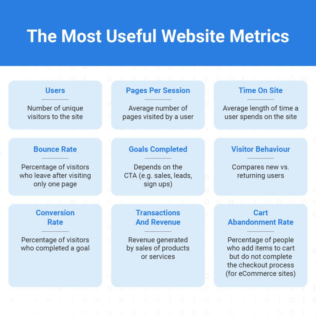
What are the most useful website metrics to gain insights from?

Conclusion
Creating a high conversion business website is no easy task. There are numerous factors to consider at each stage of the website design process that could dramatically affect the success or failure of a website. However, following these steps will help web developers complete a website project with less of a headache.
For in-house teams, website development can be daunting, time-consuming, and unsatisfying as companies may not be able to hire enough specialists to cover the spectrum of tasks needed to complete a full and complex company website.
On the other hand, enterprise-level businesses that integrate with Admiral Digital benefit from our dedicated project teams in the areas of Website Development, Content Strategy, UX/UI Design, and Performance Marketing. Our specialists empoy these best practices to drive remarkable results for clients.
Need a trusted partner for your new project? Drop us an email at hello@admiral.digital for a free consultation and expert advice.
