Table of Contents
What is UI Design?
User interface design (UI) is the process of creating website, software, or mobile application interfaces through rational and methodical selection of interface elements. A good UI designer intimately understands these elements and goes through the UI design process to develop wireframes, mockups, and prototypes that web or software developers inevitably use to build the interfaces.
Although UI design is a broad field, this article will cover all key areas of UI design and also best practices and tips to ensure consistent results.
What are UI design elements?
Interface elements are features on an interface that help users access, navigate, and take action on the website or app. These elements take many forms and may include:
- Input controls: Interactive elements that allow users to enter information including textboxes, buttons, dropdown lists, and toggles.
- Navigational elements: Exploratory elements that guide users to different parts of the website, including sliders, search fields, pagination, hamburger menus, tags and icons.
- Informational components: Informative elements that contain messaging users should know including tooltips, progress bars, and message boxes.
- Containers: Content grouping elements that keep information in a certain section of the screen or page. A salient example is an accordion menu.
How is UI and UX different?
Often coupled together, UX or user experience design is mistakenly thought to be interchangeable with UI design. While there may be overlapping goals, UI and UX are very distinct fields with their own processes and priorities.
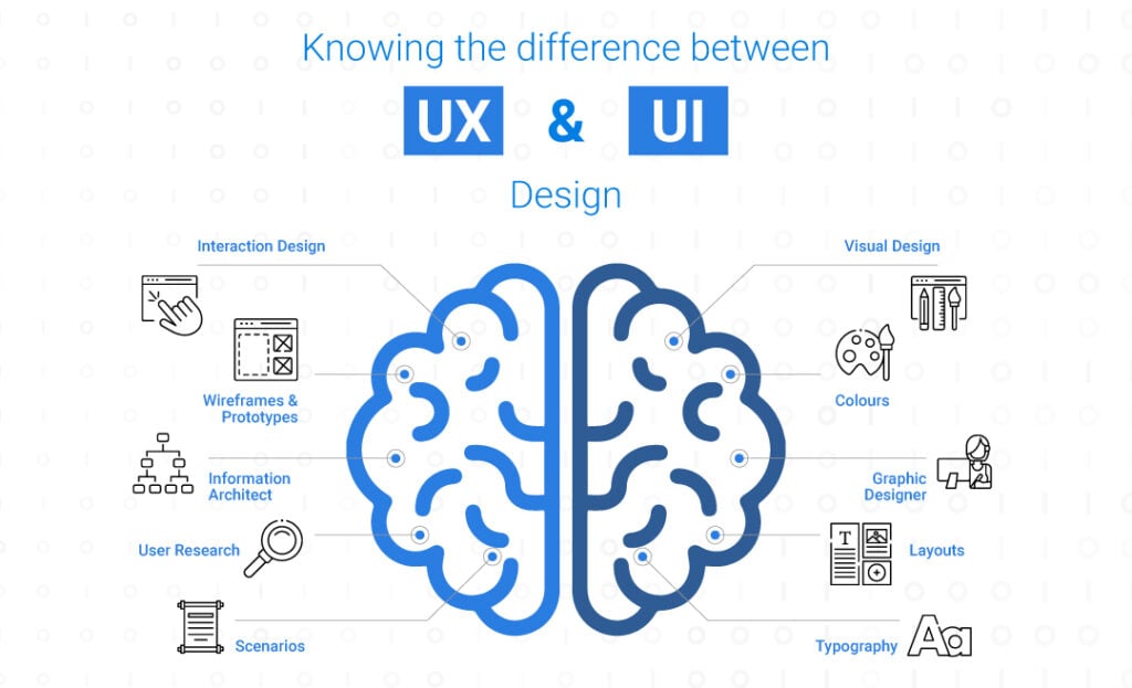
The main difference is that a UX designer is concerned with the end-to-end user experience whereas a UI designer is focused on the visual experience and interactive elements. The infographic below illustrates these differences:

Think of an architect vs. an interior designer. An architect is there to ask “Why is this building being built? Who will inhabit it? What is their purpose for being in the building?”. He will then start planning the structure and keeping the users needs and pain points in mind the entire way. Once the architect is finished, only then will the interior designer step in to ask “What should this building look like?” The interior designer can choose the most appropriate visual elements including the wallpaper, furniture and decorations.
10 Principles of UI Design
These ten principles are general rules of thumb that can be applied to any UI design for websites, software, or mobile applications. They were formulated by the Nielson Norman Group, a UX/UI focused research organisation, through extensive study and research. Below is a summary of each for ease of reference and understanding.
1. Keep users aware
Users should know their status within the system and be able to predict outcomes of their actions.
2. Use simple language
Avoid jargon! Make users feel comfortable by using familiar phrases and relevant imagery.
3. Provide an exit
Give users a clear and discoverable way to backout of a process or undo an action.
4. Be consistent & have standards
Place things where users expect them to be according to platform norms and expectations.
5. Prevent errors
Error messages are not enough, good design anticipates and prevents problems before they occur.
6. Recognition > Recall
Content and interface functions should be visible and easy to access for better memory activation.
7. Speed up interactions
Expert or repeat users should have access to shortcuts and personalised content.
8. Focus on essentials
All elements on the screen should be necessary and important, otherwise it’s distracting.
9. Guide users to solve errors
Visually highlight errors with simple messaging and colours while offering a solution.
10. Provide help immediately
Help articles and useful suggestions should be easy to find or instantly appear when required.
The UI Design Process
The following step-by-step guide explains the basic process UI designers go through from brief to final product.
Understand the project
It’s essential for the UI designer to know the purpose and context of what they are trying to design. When working with external clients, they should ask specific questions whose answers will guide them into fleshing out the design. This is often called a project brief and should at least include the following:
- Project background — What does the company do? What does the product do? What is the project about?
- Goals — What is the company trying to achieve with this project? How does it benefit the users? How does it benefit the company?
- Metrics — What key performance indicators (KPIs) will measure the success of the project? What targets are trying to be met?
- Target audience — Who are the intended users of the product? What are they like? How are they familiar with the brand or the product itself?
- Stakeholders — Who does this project involve? How is each stakeholder affected by the product? How will each stakeholder interact with the product?
- Scope — What deliverables is the UI designer responsible for? Which screens? Which interfaces?
- Deadline — When should these deliverables be completed by?
Conduct competitor benchmarking
Before UI designers dive into creating interface elements, it’s important to gather design inspiration and ideas from other websites or digital products to narrow down the visual theme and feel. By looking at competitor websites, for example, designers can put together a UI library that contains various options for each element based on the direction the designer aims to achieve.
These elements can be grouped into categories such as animations, colour, informational elements, input components and typography. Now that the designer has a basket of creative assets to draw inspiration from, they move to the more hands-on part of designing.
Define screens and user behaviours
A design team should be clear on exactly what screens need to be designed and how they form part of the user journey. While it is more of a UX designer’s job to clearly map customer journeys and user flows, the UI designer needs to take these into consideration to make the UI interface elements effective.
Design screens and UI elements
Naturally, the most important part of the UI design process is designing the screens and interface elements themselves. Remember the UI library we mentioned earlier? UI Designers draw inspiration from those assets to create their own.
Wireframing and prototyping
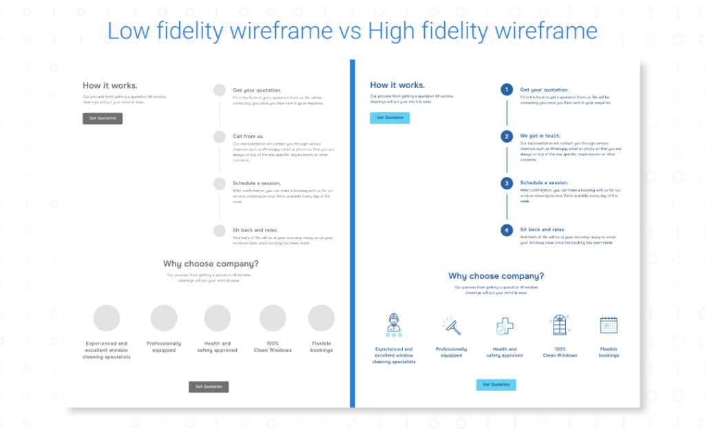
The wireframing and prototyping step is the part of the design process where the designer begins to actually construct what resembles the final product. It’s important to develop low fidelity wireframes first before developing high fidelity wireframes or prototypes. Since low fidelity wireframes don’t require elements to be fully designed, they should be shown and examined by the client for their feedback and confirmation on elements chosen.
What is the difference between a low fidelity wireframe, high fidelity wireframe and a prototype?
- Low fidelity wireframes display the structure and layout of a page without design elements or interaction
- High fidelity wireframes adds visual elements to the wireframe such as images, colour, and typography, but remain static
- Prototypes resemble the final product due to the addition of interactive elements that show user flow.
Hand-off to developers
Once the prototype has been presented to the client and feedback has been incorporated into the prototype, the UI designer can finally hand off the design to the developer. It is crucial for the UI designer to clearly explain any changes made throughout the design process that could impact its development. Developers will also benefit from having the UI designer run through each interaction to ensure consistency with the prototype.
That completes the UI design process. Now that we know what UI design is and how to start designing, here are some best practices to help guide new designers.
6 UI Design Best Practices
For those already familiar with the principles of UI design and the UI design process, this section of the article may be more useful. These are some of the best practices sourced from active UI designers in the field who have gone through the design process hundreds of times and know what works and what doesn’t.
- Know the audience – Think through who will be visiting the website or using the software that the interface is intended for. All design principles should be tailored to the audience, not simply followed for the sake of following.
- Keep interfaces simple – Avoid putting unnecessary elements that can distract the user from their desired actions.
- Use common UI elements consistently – When users see UI elements they’re already familiar with, they feel more comfortable interacting with the interface. Once these common UI elements are chosen, they should be applied consistently across the interface for maximum effectiveness.
- Thoughtfully construct page layouts – Attention should be given to the spatial and spacing relationships between objects. The principles of visual hierarchy should be applied here so that a user’s eyes are drawn to priority UI elements.
- Leverage colour and texture – User attention can be drawn to or away from a section of a screen or a particular element through careful use of colour, light, contrast, and texture.
- Create hierarchy through typography – By using contrasting sizes, fonts, and placements of text, interfaces will be more readable and scannable.

