Table of Contents
What is UX design?
Note: For the difference between UX and UI design, check out our UI design blog!
User experience (UX) design is a multidisciplinary field that combines visual design, programming and psychology to craft seamless experiences for users. It is the process of increasing user satisfaction with a digital product by improving functionality, ease of use and convenience.
When a user interacts with a website, mobile app, or other digital product, they gain an experience with the brand. If it’s a positive experience, they may buy their products, read their blogs or contact the brand for more information. However, if it’s a negative experience, it can lead to them disengaging with the brand and seeking alternatives.
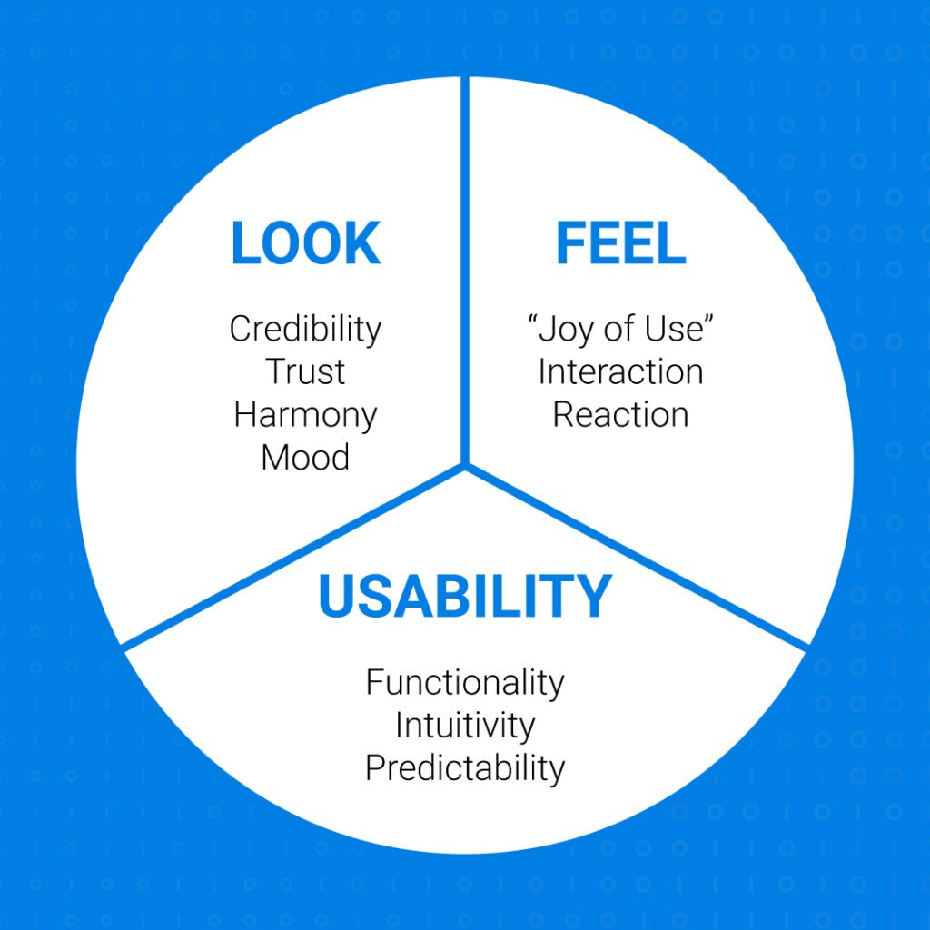
Therefore, user experience (UX) design is looking at each component of the user journey to ensure they are all aligned towards creating an overall positive user experience. It encompasses the look, feel, and usability of the product.

Users should feel comfortable and motivated to navigate the website or app and take action to achieve their desired goals. Rather than assuming user preferences, UX designers leverage market research, product development, strategy, and design to create a holistic customer experience.
UX design is an iterative process that begins and ends with user understanding in mind.
What are the four disciplines of UX design?
According to the Interactive Design Foundation, there are four disciplines that are subsets within the larger umbrella term of UX design.
Interaction Design
Although the definition may sound like an overlap of UI design, interaction design focuses specifically on elements that users interact with. These may include words, visual objectives, space, time and behaviour.
Visual Design
Designers use creative visuals such as graphics, photos, typography, colour, and layout to create immersive experiences for users. Concepts such as visual hierarchy and colour contrasting to guide a user’s eye to the right place on the page is central to their role. Graphic design is an important part of developing the look and feel that will attract customers.
UX Research
In order to define an ideal experience for a user interacting with a particular digital product, UX research uses a structured qualitative and quantitative approach to gather, test, and analyse data and incorporate the findings into the final product. Qualitative research includes conducting interviews and usability tests to gather information about user needs and motivation. Quantitative data then tests the results of qualitative research to form conclusions.
Information Architecture
Organising content in a structured and accessible way is known as information architecture. It is placing and labelling content in a way that makes it easily understandable and discoverable. It also helps users navigate the digital product to find the areas most desirable for them. Elements such as text, labels, descriptions and content are all part of information architecture.
What is the UX design process?
While there are a variety of approaches to UX design, we found the following process to be the most comprehensive in addressing each aspect of the user experience.

Discover
At the discovery stage, the UX designer begins to understand the project, its scope, its users, and their pain points. Following which, they can begin to conduct extensive competitor analysis and user research to gain a deeper understanding of the audience and how rivals have approached them. User research is ideally done by interviewing a set of users and asking them relevant questions that would shed light on their needs and preferences.
Tactics: Stakeholder interviews, surveys, competitor research, data analysis
Define
At the defining stage, all of the research that was gathered in the previous stage is used to develop concrete definitions of who the users are and how they usually interact with the product. By building user personas and narratives, UX designers can narrow down product features that will be useful to the user and start working towards a solution.
Tactics: User personas, assumption mapping, narratives, empathy maps, storyboards
Ideate
At the defining stage, all of the research that was gathered in the previous stage is used to develop concrete definitions of who the users are and how they usually interact with the product. This can be accomplished by constructing user flows to map out each possible interaction scenario. Moreover, by generating user personas and narratives, UX designers can narrow down product features that will be useful to the user and start working towards a solution.
Tactics: User personas, assumption mapping, narratives, empathy maps, storyboards
Prototype
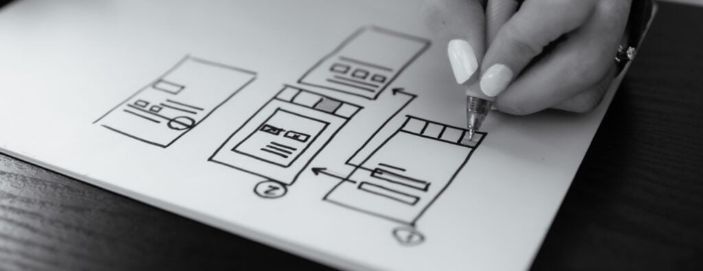
At this stage of the process, UX designers can start wireframing and prototyping the final product. A wireframe is a skeleton layout of the intended final design and includes core functional elements. The wireframe can then be presented to relevant stakeholders to gain early feedback on particular design choices.
Wireframes are usually low fidelity, meaning they look plain and lack colour, typography, and other visual elements. After processing feedback, UX design skills should be employed to create a high fidelity prototype that includes visual and interactive design elements and closely resembles the final product. This will enable it to be tested for usability more accurately.
Tactics: Mockup, wireframe, prototype
Test
The last stage before handing off to developers is user testing the prototype. Usability testing is conducted to examine how actual users interact with the system and how it works for them. The feedback can then be looped back in to update the prototype and be tested again. This is what’s known as an iterative process and is the best method of improving and enhancing the final product.
There are two kinds of usability tests:
- Laboratory usability test: The user is placed in a private, quiet area and observed by UX researchers while they interact with the prototype. As the user goes through different screens, researchers will ask particular feedback questions about their experience to gain deeper insights.
- Remote usability test: These tests are conducted with the users in their natural environment, such as their home or office. After interacting with the prototype, they are requested to fill out a questionnaire that will ask about how their experience is going and whether there are any issues that prevent them from accomplishing any task.
Other tactics: A/B testing, heuristic evaluation, performance testing, eye tracking
Once testing is complete, the UX designer works in tandem with UI designers and web developers to ensure the final product contains all the core functionality and design elements agreed upon.
What are key principles of UX design?
These are not strict rules but rules of thumb that guide UX designers into making good choices about every aspect of the user experience.
Keep a user-centric approach
Since UX designers spend much of the early design process learning about users and their pain points, a successful design is centred around making users happy. This seems obvious, but as designers become more experienced with complex web design layouts, they may be more concerned with impressing other UX designers or testing new approaches regardless of how it may impact user experience. Instead, adopt an iterative approach with regular user feedback intervals to ensure each process informs the other.
Be consistent across interfaces
Design and functionality should have the same look and feel across pages in a website, or screens in a mobile app. Users should feel comfortable navigating through different sections of the product and there should be a consistent flow that runs throughout. The more familiar a user feels with the interface, the easier it will be for them to use it.
Maintain a clear hierarchy
Seamless navigation throughout a page requires all of the elements to be placed in a deliberate manner, according to hierarchy. There are two different kinds of hierarchy: content hierarchy and visual hierarchy. Content or information hierarchy is making sure the site map and navigational elements conform to user expectations when they explore different pages within a website. Visual hierarchy, on the other hand, is arranging the text, images, buttons, and other elements according to their importance on the page and the natural way viewer’s eyes will see the page. For more information about visual hierarchy, check out our blog specifically on the topic!
Choose simplicity over clutter
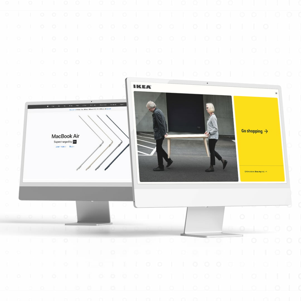
Think of consumer giants Apple and IKEA –what sets their branding apart from the competition? Simplicity. From their website to their ads, they use minimal copy and simple, impactful imagery to convey the exact same idea as a wall of text and library of pictures.

Rather than having numerous content blocks stuffed with information, these brands combine simple taglines with striking imagery so that users can focus on browsing their products rather than reading copy.
Make it all accessible
With the rapid development of digital products across all walks of life, it’s never been more important to ensure websites are equipped for people who interact with products differently or who are handicapped. There are various ways to improve accessibility, such as increasing text readability, using high contrast colours, or making sure all images have alt texts. The goal is to remove any friction users may have in relation to how they access the product.
Give users control
Rather than dictating each step the user needs to take, it’s better to give users enhanced controls so that they can solve their own problems and reach outcomes faster. For websites, an in-page search function is an effective way for users to find the exact information they want on your website, such as a particular product or section of the page. For apps, functions like undo to reverse an action or cancel to remove the action gives users more flexibility in their interaction.
Six characteristics of good UX design
After the UX design process is completed and the principles have been applied, what should the final product look and feel like? Peter Morville’s UX honeycomb lists down the attributes that a digital product should have before it’s ready to be delivered to the client.
- Usable – Users are able to accomplish their goals
- Useful – Users are able to solve their problems
- Desirable – The product should be visually appealing and evoke emotions
- Findable – Lost users they should be able to navigate back
- Accessible – Able to be used by all audiences
- Credible – The product and its owner are upfront and honest with information
If a digital product ticks all these boxes, then the UX designer has done their job in addressing user concerns by developing a product that delivers on its promise.
Final Thoughts
UX design is a multidisciplinary process that puts users at the centre of the design approach. With the proper principles and processes from this article in mind, UX designers can embark on their next UX project with confidence. For more information on UX design, don’t hesitate to reach out to our UX team by dropping us a message at hello@admiral.digital.
